Hopin is a British software, developed in 2019 by Johnny Boufarhat. The services carried by the soft include crowdsourcing, networking and information exchange via online conferences. The Hopin’s main target audience consists of companies and organizations with the branches and employees spread across the world. It’s a totally remoted company, without any physical offices or other points of presence. Hopin works with around 100000 clients, including UN, NATO, The American Express, et cetera.
Meaning and history
The company was established in January 2019. Hopin appeared during the coronavirus pandemic. It was an online solution for organizations and businesses that wanted to organize their operations in total distancing. Initially, the company had only 6 employees. For the years to come, the number of workers grew to 800+. It grew from a small startup made for disabled people who cannot get out to the streets to a large business-to-business conferencing system today.
What is Hopin?
Hopin is an online social platform for businessmen and organizations, founded by a British enterpreneur Johnny Boufarhat. Hopin software offers information exchanging, chatting, teleconferencing services, et cetera. This is one of the most fast-growing online businesses, with its total evaluation after the half of a year of operation counted at over $2 Billion, and in 2022 – more than $7 Billion. Hopin doesn’t have any physical branches or departments – this is a fully online project with employees spread across the world.
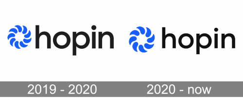
2019 – 2020
The first logotype was composed of the brand name, written to the left from an insignia. It featured 8 drops placed one after another in a circular position. The tips of each drop were headed to the back of the following part. It was supposed to mean that Hopin is the app connecting people together and making communication bridges between people, companies, and cultures.
2020 – today
The brand redesign had changed the insignia. Now the drops became less inclined, and there were large gaps between them.
Color
Hopin has made a bright and open brand image for its customers. The brand conception and its behavior was always supposed to unite people and motivate them to exchange their ideas. That’s why the Hopin palette consists of light shades – blue for the mark, and white for the background. The name’s color is dark gray, first to highlight it, and second to send an authority and quality message to the customers.
Font
The nameplate uses a typical office font. It has semibold sans-serif letters with a lowercase style and small gaps between the characters.


