Hongqi, a premium automobile marque, is under the ownership of China’s FAW Group. Established in 1958, it was originally created to produce luxury vehicles for high-ranking officials. Over the years, Hongqi has broadened its offerings, and its cars have been showcased in parades and diplomatic events. Today, with its base of operations primarily in China, the brand is making strides in becoming a global luxury car contender.
Meaning and history
Founded in 1958 by the FAW Group, Hongqi stands as China’s longest-standing luxury car brand. Its inception aimed to serve high-ranking officials with elite transportation. Over its existence, Hongqi has achieved prominence, often being the car of choice in Chinese military parades and diplomatic occasions. Recently, Hongqi has endeavored to innovate, introducing cutting-edge models and technologies. As of now, the brand continues to solidify its place in the international luxury car market while retaining its deep-rooted Chinese legacy.
What is Hongqi?
Hongqi is China’s oldest luxury automaker, established in 1958 by the FAW Group. It initially crafted elite cars for dignitaries and has since broadened its range.
1958 – now
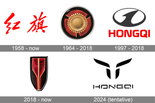
The logo created back in 1958 has been used by the company for over half a century, even after it created several other alternatives. A Chinese version of the name is the only element here. It translates as a red flag, which is probably why the designers chose a bright red color for the inscription. In addition, red is a prominent color in Chinese culture as it is associated with life-generating energy as well as success and prosperity.
1964 – 2018
The updated emblem does not have any inscription, which made it look more universal. The color palette that features, red, golden, and black with a silver outline create an association with a country that has a long history. A metallic golden flower with three red petals and three golden points on the side of each red petal is the main element here. The black base gives the logo a more sophisticated appearance and allows this flower symbol to stand out even more.
1997 – 2018
Although this might have been unintentional, this logo instantly draws an association with the Hyundai brand logo that was created several years earlier. All in all, an oval shape has been used by many brands, and this time, it is done in white and black. A smaller white oval shape inside was intersected by a black line that reminded of a road going into the horizon. It not only made an association with the automotive industry but also symbolized movement and future possibilities.
2018 – now
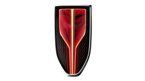
The company continued to use powerful red and black colors. The style resembles the logo created in 1964 with varying red and black gradients. The new logo has a shape of a shield with a black background, silver border, and red shape. The latter had narrowed toward the bottom and appeared to have a three-dimensional shape. The black background has a wire mesh pattern done using thin red lines. The logo turned out very impressive and mesmerizing.
2024 (tentative)
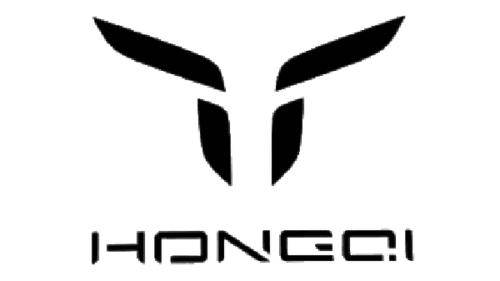
A modernized logo consists of a name and an illustration above it. The name is printed using a geometric, sans-serif font with slits between the strokes that added a unique touch. The font resembled Perseus Arm Regular font. The emblem above consists of two diagonal lines and two vertical ones that create an abstract illustration that resembles a bull’s head. It’s not a sure fact, though. Instead, it is likely an abstract, minimalistic version of the previous shield emblem.


