Hispano-Suiza is a luxury automaker, originally founded in Barcelona in 1904. It boasts a rich history of producing high-end cars and aircraft engines. Currently under the ownership of the Grup Peralada, it operates mainly in Spain. With a reputation for quality and innovation, the brand is a symbol of opulence in the automobile industry.
Meaning and history
Founded in 1904 by Damian Mateu and Marc Birkigt in Barcelona, Hispano-Suiza quickly rose to prominence for its luxury automobiles and influential aircraft engines during the World Wars. One of its renowned feats was the V8 aero engine, which powered numerous planes in WWI. Fast forward to the present, Hispano-Suiza, now under the Grup Peralada, has re-emerged with a renewed focus on creating high-end electric vehicles, signifying a blend of its storied past with modern innovation.
What is Hispano-Suiza?
Hispano-Suiza is a historic Spanish-Swiss luxury automaker founded in 1904. Renowned for its high-end cars and aircraft engines, the brand represents a legacy of innovation and opulence.
1904 – 1907
The earlier logo version of the Hispano-Suiza brand looks luxurious as it is done in a black-and-white with an elegant frame inside. La Hispano-Suize is printed using all uppercase letters in two lines. The top line is curving across the top, while the second line runs straight across slightly lower than the center. The location of the company, Barcelona, is printed using a slightly smaller font at the very bottom.
1907 – 1914
A delicate and very graceful cursive font has been chosen to write the name. It is printed in one line using black, which enhances its sophisticated look. Above, it features a flying stork, which symbolizes a bright future and the bird is surely flying towards it with determination. The logo also has a tagline at the very bottom that says “Fabrica de Automoviles S.A.”.
1914 – 1936
The bird symbolism is also seen in this logo. This time, the company used two white widespread wings placed over a red circle with yellow and white elements. Just like in the previous logo, the designers went for a sophisticated and delicate cursive font choice, which seems to be very appropriate for a brand that focuses on creating luxury automobiles.
1917 – 1936
The winged symbol seen earlier was presented as a three-dimensional shape. The round base had a bubble texture with a flower-like symbol in the center. The latter connected the two wings, just like in the other logo version. The yellow line was extended all the way to the bottom, covering the white cross. The whole emblem is done using professional, conservative colors – black and white.
2010 – 2019
The designers did a great job bringing together the old brand image and modern design styles. They used the logo created in 1914 as the base, giving the wings a more abstract look and transforming the shape of the whole emblem into a triangular shape. The choice of colors was preserved, although the shades were changed. The name now features a bold, geometric font without serifs. It resembles a font by Jayde Garrow called Be A Pro but with customized letters “A” and “P”. The inscription is done in dark gray color to match the lines in the illustration above and create a professional appearance.
2019 – 2021
It looks like the company understood that the graceful cursive fonts became closely associated with this brand. Thus, they brought back the font used back in 1907, which instantly brought an association with the brand that was well-known a century ago. The wings now had a sharper appearance that gave the logo a more dynamic and modern feel that was enhanced by a gray gradient. They also brought back the round red shape, further enhancing the well-established history of the brand.
2021 – now
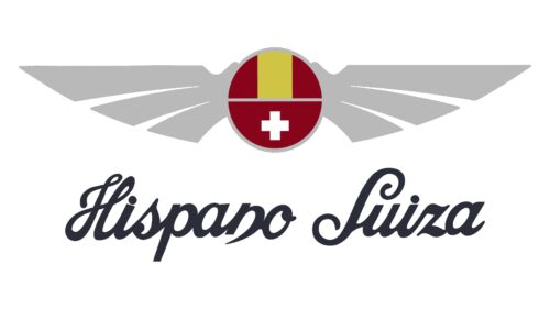
This logo has the same shape, color palette, and inscription as the previous one. However, it does look different as the metallic color of the wings is now replaced by a muted, light gray color with no gradient. The red and yellow also did not look as bright. The updated color shades gave the logo a richer and more modern touch.


