HEB, stylized as H-E-B, is the name of one of America’s largest private chains of supermarkets, which was established by Florence Butt in 1905 in Texas and still has most of its locations in its motherland state. Today the chain operates more than 300 stores across Texas and Mexico.
Meaning and history
H-E-B is a great example of how a private company can compete (and win) with public corporations, chains, and networks. The privately held supermarket chain is in the top parts of all the possible rankings, including Forbes. With its 340 locations over Texas and Mexico, H-E-B has more than 100 thousand employees and about 30 billion USD revenue.
The history of the company’s success started in 1905 when Florence Butt opened a small grocery store in San Antonio, Texas. The store was located on the ground floor of Florence’s house, and the business was going well for years. After Florence’s son came back from the army in the 1920s, he started expanding his mother’s chain and opened a few more stores in the area.
In the 1930s the chain of the grocery stores, named H-E-B (flyer the initials of Florence’s son, Howard Edward Butt), was finally incorporated. By the middle of the 1950s it was already a huge and very reputable player on the Texas Market, and today it is considered to be number one.
What is H-E-B?
H-E-B is one of the oldest privately owned chains of supermarkets, which was established in San Antonio, Texas, at the beginning of the 20th century, and named after Howard Edward Butt, the son of the chain’s founder, Florence Butt. Today the company owns supermarkets and organic product stores all over the state.
In terms of visual identity, H-E-B is probably the most consistent supermarket chain in the USA. The company still uses the logo, designed for it in the very beginning, after the incorporation. The badge says it all with its bright colors and bold massive elements, softened by a smooth framing, which makes everything look friendly and welcoming.
1905 – 1938
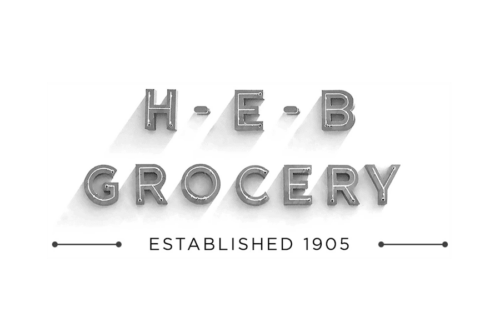
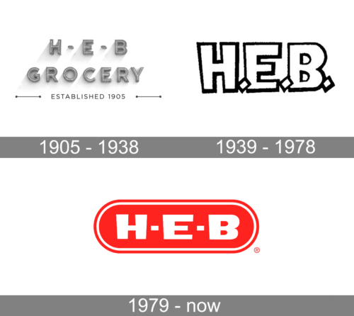
The new company came up with a simple, yet clear and confident. The top line had the initials “H.E.B” spaced widely apart and separated by dash lines. The next line had “Grocery” printed using the same font but with letters being spaced closer. They used all uppercase letters that were gray in color with a thin white line running down the center of each stroke. Each letter looked three-dimensional and even cast a shadow, which made it appear that the letters were made from cement. At the very bottom, the emblem said the establishment year, which seems very impressive over 100 years later.
1939 – 1978

The owners further simplified the logo after the chain of stores was incorporated. The logo now had only the initials. They were spaced very closely and the dash lines dropped to the bottom to resemble tilted rectangular dots. The logo used a basic sans-serif font with straight strokes of uneven thickness, which gave an impression of a handwritten logo. Each letter was done in white and had a black outline to help it stand out on any background. There were no other elements in the logo.
1979 – Today
The H-E-B logo features a horizontally stretched badge with rounded sides. The ellipsoid in a double framing and with a massive logotype over its main part is executed in a powerful and bright scarlet-red and white color palette, which stands for strength, professionalism, and progressiveness.
The primary version of the logo features a red badge with a white “H-E-B” inscription in a custom extra-bold sans-serif typeface. Although, there is also a secondary version, where the white badge gets placed on a solid red background, and has the lettering written in red. In both cases, there is a double red and white outline, which has its internal and external lines alternating depending on the main background.


