Hasbro is a toy manufacturing company, which was established in 1923 in the United States. The company owns several different brands of toys and table games and is considered to be the world’s biggest company in its segment.
Meaning and history
The name of the brand, Hasbro, is a derivative from the company’s original name, Hassenfeld Brothers. Since 1968 the business changed its name several times until it finally came up with Hasbro in 1985.
Hasbro is a company with a rich history and its visual identity has undergone numerous redesign, as the company was growing.
1923 – 1944
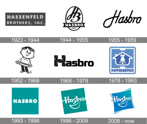
The original logo of the company was created in 1923 and stayed with the brand until its renaming in 1944. It was a gray horizontally-oriented rectangular banner with the bold white “Hassenfeld Brothers, Inc.” lettering in the uppercase of a geometric sans-serif font. The upper line featured a slightly larger size ofcharacters than the bottom one.
1944 – 1955
The original Hasbro logo was designed in 1944 and was a classic representative of its times. The oval medallion with an “HB” monogram and a straight ribbon with a “Hasbro” inscription in it, was executed in monochrome and looked strict and elegant.
1955 – 1959
In 1955 the company decides to use a single word mark in cursive for its visual identity. The letter “H” has its left vertical bar elongated and curved, while all the other letters are modest and small, executed in a hand-drawn typeface.
1952 – 1968
The new logo was designed in 1959 — a funny man, who had a “Hasbro” inscription at the bottom of his white shirt. The wordmark in all the capitals was executed in a bold rounded sans-serif typeface. It was a very friendly and kind logo version of the brand.
1968 – 1978
In 1968 the logo becomes stronger and more modern. Now it is a bold nameplate with the enlarged letter “H”, which is formed by many triangles and had a mosaic pattern. The logo is still in monochrome and it makes it contemporary and confident.
1978 – 1993
The first colorful version of the Hasbro logo was created in 1978. A tender blue square with rounded angles and white outline depicted a silhouette of a house with two kids figures inside. The “Hasbro” lettering was placed under the house and executed in a bold sans-serif with the use of a darker shade of blue.
1993 – 1998
The simplified version of the logo in a new color palette was performed in 1993. The Hasbro logo now is composed of a white bold nameplate placed on a sea-blue background. The color combination of the company’s new visual identity evokes a sense of safety and reliability.
1998 – 2009
The redesign of 1998 keeps the color scheme of the previous logo but changed composition and typeface. Now the “Hasbro” lettering is executed in a smooth custom sans-serif typeface with bold soft lines and the curved horizontal bar of the letter “H”. An abstract image of the smile is drawn under the inscription in thin white lines. The sea-blue square is placed diagonally.
2009 – Today
The company keeps the composition and wordmark of the previous version, but the contours and colors were refined. The square’s sides are now slightly arched to the center and the sea-blue shade is replaced by a more traditional blue.
The Hasbro logo today is a reflection of a loyal company, which values quality and traditions and aims to provide their little customers with the best toys, to make them smile.


