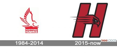
The vivid shade of red and the bird design have been the recognizable elements of the Hartford Hawks logo since at least 1984.
Meaning and history
The Hartford Hawks are a well-known sports entity founded as part of the University of Hartford, Connecticut. Their inception dates back to the establishment of the university in 1957, marking a significant period in the history of collegiate sports in the area. This athletic division has grown significantly over the decades, establishing a strong reputation in various sports disciplines.
Central to their achievements, the Hartford Hawks have made notable strides in basketball, soccer, and baseball, with their teams regularly participating in NCAA tournaments. Their basketball team, in particular, has gained substantial recognition, showcasing exceptional talent and sportsmanship in numerous competitive encounters. These achievements reflect the dedication and spirit embedded in the Hartford Hawks’ ethos.
As of today, the Hartford Hawks continue to play a vital role in the NCAA landscape. They maintain a strong presence in intercollegiate sports, contributing significantly to the competitive spirit and camaraderie that define college sports. Their ongoing participation in various NCAA tournaments and events underscores their enduring commitment to excellence in athletics and sportsmanship.
What is the Hartford Hawks?
Hartford Hawks represent the University of Hartford’s athletic teams in NCAA Division I sports. Known for their competitiveness in basketball, soccer, and baseball, they have a rich history of participation in various NCAA tournaments, reflecting a strong sports tradition and spirit.
1984 – 2014
When the team decided to develop a new logo in the 1980s, making a hawk its centerpiece seemed the most obvious choice. The creature was depicted with its wings spread. The name of the team was positioned below.
2015 – Now
In 2015, the emblem was updated. The letter “H,” which now dominates the Hartford Hawks logo, houses the head of the bird.
Hartford Hawks soccer
The men’s soccer program has made four NCAA Tournament appearances. They have earned the title of America East Tournament Champions four times and have become America East Regular Season Champions two times. The women’s team appeared in the 1992 College Cup. They have made 13 NCAA Tournament appearances, have been named America East Tournament Champions seven times and have gained the title of America East Regular Season Champions 13 times.
Hartford Hawks Colors
RED
PANTONE: PMS 485
HEX COLOR: #C02427;
RGB: (192, 36, 39)
CMYK: (0, 95, 100, 0)
BLACK
PANTONE: PMS BLACK
HEX COLOR: #0F0708;
RGB: (0, 0, 0)
CMYK: (25, 25, 25, 100)
WHITE
PANTONE: P 1-1 C
HEX COLOR: #FFFFFF;
RGB: (255, 255, 255)
CMYK: (0, 0, 0, 0)


