Harris Teeter is one of the brands of the larger Kroger corporation with close to 300 stores as well as close to 100 fuel centers. It is primarily selling organic, high-quality food with a great variety of options and focuses on providing an exceptional shopping experience. Nonetheless, one can find Harris Teeter both in urban and rural areas. Like many supermarkets, Harris Teeter has several branded lines, which include seafood, meat, produce, deli, and bakery.
Meaning and History
The name of the business comes from the last names of its founders, who started the company back in 1960. They both already owned supermarkets that also carried their name. They joined forces after they both purchase a warehouse. The new company did not stay in their ownership for long as they sold it to Ruddick Corp. nine years later. The new management continued the expansion by purchasing other companies and did not change its strategy even when there was an economic downturn. In 2013, The Kroger Co. made this large chain one of its subsidiaries.
What is Harris Teeter?
This is a grocery chain with over 250 locations across the Southeast that is based in North Carolina.
1960 – 1976
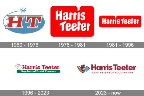
The first logo consisted of the initials “HT” on a teal oval background. The oval shape, though, was not one solid color and was partially white. Moreover, the upper half was done as a line with a star at the end. It resembled fireworks and created a feeling of excitement. The initials were the main element that caught the attention thanks to their bright red color and white outline that made them stand out even more. The wide strokes and bracketed serifs enhanced an image of a strong company.
1976 – 1981
A new, bright version of the logo appeared in 1976. It featured “Harris Teeter” printed in white letters with slanted cuts and rounded corners. The white color looked perfect against a saturated red background. The latter was done in the form of a rectangle with rounded corners. A unique feature of this logo was a dot above the “i” that went beyond the base, so it no longer looked like a perfect rectangle.
1981 – 1996
The updated logo did not look much different. The company simply wrote the name in one line, keeping the font the same while adjusting the shape of the background accordingly.
1996 – 2023
The designer Shook Kelley used a stylized serif font of red color for the name. The red background was removed. Three white icons of bread, fish, and apple with colored outlines were placed on the left and made it very clear what one can buy in the store. It was a simple, yet very appropriate logo for a company selling food.
2023 – Today
The name here has a maroon color, which makes the company appear more solid. Underneath, there is a new slogan, which is printed in smaller uppercase letters to be the same length as the name. Three icons on the left were now a solid color with a black outline. A fish was sky blue, an apple was maroon red, and the bread was a light brown color.
Font and Color
The original logo features a bold typeface with bracketed slab serifs. For the next twenty years, the company used the same font for its logo. It was bold and italicized and had rounded corners and slanted cuts. Since 1996, the company used a font that resembled Jester or modified Filmotype Arrow. The logo introduced in 2023 features a more modern, block-style typeface. Since the foundation, red was the main color of the brand. It was typically accompanied by white and muted light blue. Red is a color of powerful companies, while white is a good contrasting color that is also often used to represent perfection.


