Hampton by Hilton is a hotel chain trademarked by Hilton Worldwide. It used to be known under the name of Hampton Inn and is still often called this way.
Meaning and history
Initially, the company was established in 1984 as the Hampton Inn. It was a budget hotel chain that belonged to the Holiday Corporation. By the early 1990s, it was already being transformed into a middle-market hotel chain. In 1990, it already consisted of 220 properties.
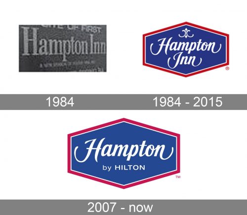
The company’s archives have preserved a prototype Hampton Inn logo from 1984. There, the name of the chain was set in an utterly simple serif type. It was set in block letters and didn’t have any pictorial elements.
1984 (official logo)
Quite soon, however, the chain introduced their “real” logotype. It already looked pretty much like the current one.
The lettering “Hampton Inn” featured a cursive type inspired by calligraphic handwriting. The elegant style was formed partly by the varying widths of the strokes and partly by the decorative extended ends of the first and final letters.
Also, there was the so-called cartouche above the word “Hampton,” which added an elegant and refined touch. The shape of the logo can be described as a flattened hexagon.
There was also a version featuring only the name of the brand in red, without the trim.
1984 – 2015
2007
When the “Hampton Inn” brand was replaced by “Hampton by Hilton,” the logo was updated, too.
It now featured a slightly different shade of blue and red. The word “Inn” disappeared. Instead, you could see the lettering “by Hilton” in a totally simple, perfectly readable sans. The refined cartouche was gone.
Hampton Inn and Suites
The Hampton Inn and Suites brand was unveiled in 1995. Unlike the main chain, this one was made up of two-room suite-style hotel rooms including living room and kitchen areas.
The original logo showcased the name of the chain inside a rectangle with rounded corners. The cartouche was also present and positioned in the same place as on the main Hampton Inn logo.
Later, the logo was slightly updated. The blue was replaced by a darker and calmer shade. The red trim was also modified – the tint looked warmer now. But the most notable modification, of course, was the shape of the logo – it was now a flattened hexagon.
Colors
An older, four-color version of the logo included blue (Pantone #280), red (Pantone #207), and gray for the cartouche (#400). However, on the current emblem, the grey color isn’t present.


