Hallmark Channel is the name of an American pay-per-view cable television channel, which was established in 1995. The content of the network is family-oriented and includes movies, tv-series, and original programs specialized in lifestyle. Exclusive shows include the novel series “Cedar Cove” and “When the Heart Calls”.
Meaning and history
Hallmark is one of the largest cable tv networks in the United States (the channel is available to 86 a million households) It specializes in showing traditional films for family viewing, TV series, and mini-series. The family direction is due in large part to the fact that Hallmark traces its history back to two independent religion-based television stations, ACTS and VISN.
1984 – 1988
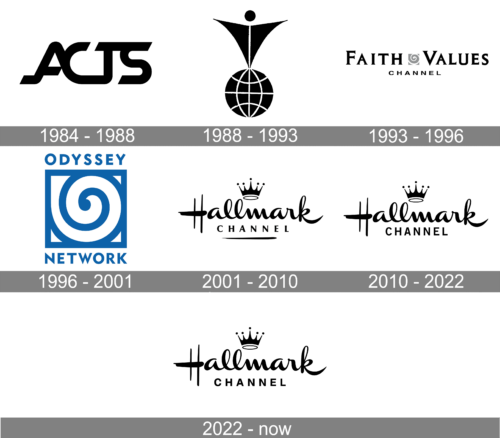
The channel, known today as Hallmark, has been forming from several networks, merging, and rebranding since 1984. So the very first badge was created in 1984, for the channel with the name ACTS, which stands for “American Christian Television System”. It was a modern stylized monogram in a custom typeface with massive yet smooth and rounded letters coming one out on another.
1988 – 1993
The logo of 1988 was already for the company with the name Vision Interfaith Satellite Network, or VISN. This time it was a graphical badge, with no lettering on it. The emblem depicted an abstract stylized figurine, resembling a man standing with his arms spread to the sides. The man was drawn as a triangle pointing down, with the solid dot attached to the upper part. The figure was standing on a black and white sphere, representing the globe.
1993 – 1996
For the Faith&Values Channel, the logo was designed in 1993. And this was a self-sufficient banner with both textual and graphical elements. The bold and enlarged inscription was set in the uppercase of a dandy serif font, with thick bars and short sharp serifs on their ends. The letters “F” and “V” were slightly enlarged compared to other capitals of the logotype. The two wordmarks were separated by a delicate gray and white emblem, with a swirl drawn on a square. The word “Channel” was set under the main part of the badge, in all capitals and a simple yet confident and solid sans-serif typeface.
1996 – 2001
The channel was renamed the Odyssey Channel in 1996, and this is when color appears on the logo of the company for the first time in its history. It was the same swirl emblem from the previous badge, but now it was enlarged and placed in the center of the composition, featuring an intense blue and white color palette. The uppercase “Odyssey” was written above the square, while the “Network” was set under it. Both parts of the lettering were executed in a bold and modern sans-serif typeface.
2001 – 2010
This is when the first official Hallmark Channel logo saw the light, in 2001. It was the iconic logo of the Hallmark brand, with the smooth cursive lettering, an elegant crown above it, and the “Channel” tagline. The tagline was set in the uppercase of a traditional sans-serif typeface, which looked sophisticated due to the lines of the letters slightly flared to their ends. For a few years (2008 — 2010) the logo was used without any crown above the inscription.
2010 – 2022
The crown officially comes back to the Hallmark Channel visual identity in 2010. And the tagline is being rewritten in the same year. Now the logo started looking more modern and stable, as the “Channel” part of the inscription switch its font to a bolder, stricter, and more modern one. With the bars of the letters even, and the shapes slightly stretched up, and narrowed.
2022 – now
The redesign of 2022 has only worked on the bottom line of the Hallmark Channel logo, refining the typeface and slightly expanding the contours of the capital letters in the sans-serif “Channel” wordmark. All the other elements, including the minimalistic monochromatic palette, remained untouched.
Font and color
The smooth and elegant lettering from the primary Hallmarkchannel logo is set in a custom fancy typeface, designed for the company in the 1950s. As for the bottom line of the badge, with the uppercase “Channel”, it is executed in a medium-weight modern Sans-serif font, which is very similar to Niva Small Caps Light, or Marat Sans Small Caps. The closest font to the one, used for the “Hallmark”, is, probably, China Bold, but with some significant modifications.
In terms of colors, the channel is very strict and traditional, using a modest and simple black-and-white combination, which also looks very professional and strong.


