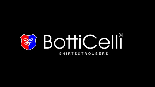
The BottiCelli logo is pretty cluttered in comparison with the emblems of most other fashion houses. Of course it is by far less elaborate than the Hermes logo, and yet, there is a variety of colors and shapes here.
Meaning and history
BottiCelli, a renowned name in the world of fashion, was founded by the acclaimed Italian designer Lorenzo BottiCelli in the early 1970s. Lorenzo, a visionary in haute couture, began his journey in Florence, Italy, bringing a blend of traditional Italian craftsmanship and contemporary design to the global fashion stage. The company quickly rose to prominence, becoming synonymous with luxury, elegance, and innovation.
Throughout the years, BottiCelli has achieved numerous milestones. The brand’s remarkable transition from traditional haute couture to ready-to-wear collections in the 1980s marked a significant evolution in its approach, making high fashion more accessible to a broader audience. BottiCelli’s pioneering use of sustainable materials and advocacy for ethical fashion practices set new standards in the industry. Additionally, its collaborations with famous artists and celebrities have constantly kept it at the forefront of fashion trends and popular culture.
Today, BottiCelli stands as a titan in the fashion industry. Under the guidance of Lorenzo’s protégé, Alessandra Fiore, the company continues to blend innovative design with sustainable practices. BottiCelli’s recent ventures into digital fashion and virtual reality experiences have further solidified its status as a trailblazer, continually pushing the boundaries of what fashion can be in a modern, digital world.
What is BottiCelli?
BottiCelli is an iconic fashion house renowned for its luxurious and innovative designs. Pioneering in haute couture and ready-to-wear collections, the company blends traditional craftsmanship with modern aesthetics, setting trends in the global fashion industry.
The Logo
The pictorial part of the logo is represented by a shield divided into two fields, a red one and a blue one. Across the shield, an intricate curvy shape is placed.
The name of the brand is given below in a simple sans serif type providing excellent legibility. Below, you can see a thick red bar housing the text “Premium men’s wear” in white.
In another version of the label, the word “BotiCelli” is positioned to the left of the pictogram. Instead of the text “Premium men’s wear,” you can see a thin bar broken down into three even parts (blue, white, and red).


