Guerlain is a luxury French brand of cosmetics and perfume, which was established in 1828 and is considered to be one of the oldest prestigious cosmetic producers in the world. The brand is a part of the LVMH Group.
Meaning and history
Guerlain is a legendary brand, one of the pioneers in luxury cosmetics. It was always on the top of the list of the world’s high-end skincare and perfume manufacturers. Guerlain is a French cosmetic and perfume brand, which was founded in 1828 by Pierre Francois Pascal Guerlain. It is considered one of the oldest houses of perfumery.
The founder of the brand, Pierre-François-Pascal Guerlain, was born in 1798 in the north of France in the town of Abbeville. Pierre-François-Pascal from his childhood wanted to be engaged in perfumery because it was during these years that he found his vocation. The boy spent his childhood in his father’s spice store, being surrounded by aromas and fragrances from all over the globe. To learn the business, Guerlain went to England to study chemistry. Pierre-François-Pascal returned to Paris in 1828 and opened his store on rue de Rivoli. This is how one of the world’s oldest perfume houses was founded.
What is Guerlain?
Guerlain is one of the oldest Houses of perfumery in Europe. This French company was founded in 1828 by Pierre Francois Pascal Guerlain. It all started in a pharmacy, where Guerlain, in his free time, experimented with the creation of fragrances. Today the brand is a part of the LVMH Group.
1828 – 2015
The Guerlain logo is composed of a wordmark, which is executed in a modern and confident sans-serif typeface. The wordmark is written in all-caps, but the first “G” is slightly enlarged.
The clean letters of the Guerlain inscription are wide and have enough space between each other, which makes the logo look lighter.
The brand also uses a signifier, which can be seen as a web-icon and also as a symbol on some of the products. It is a monogram, which consists of two intertwined letters “G” is a classic cohesive, with curved and elongated tails.
One more brand’s symbol, that the company still placed on some of its products, was first designed in 1853. The famous Guerlain bee was a label’s emblem for the most time of its history. It is a reflection of royalty and also shows the use of bees products in the Guerlain skincare line.
The monochrome color palette of the Guerlain logo makes it look elegant and strong. It shows the timeless brand, which is also progressive and future-thinking.
2015 – 2022
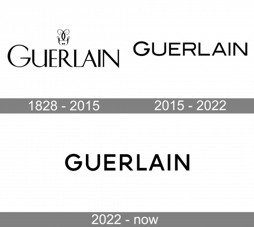
The redesign of 2015 has removed the iconic monogram from the primary Guerlain badge and switched the typeface of the lettering to a more modern and stable sans-serif one. The uppercase logotype now has the first letter slightly bigger than others and features extended shapes of the characters, executed in thick lines with straight cuts.
2022 – Today
In 2022 the Guerlain badge was redesigned again, with the refined typeface and all characters of the logotype in one size now. The new concept features bolder lines and more space between the glyphs, looking more solid and stable, and showing the confidence of the brand and its experience.
Font and color
The bold and modern uppercase lettering from the primary Guerlain badge is set in a heavy sans-serif typeface with clean contours. The closest fonts to the one, used in the Guerlain insignia are, probably, Aeroport Medium and Typold Extended Medium.
As for the color palette of the Guerlain visual identity, the luxury French perfume house uses black and white for the primary badge, which can turn into gold for the packaging of the branded products. This choice makes the Guerlain logo look timeless and sophisticated no matter what.


