

![]() Government of Canada Logo PNG
Government of Canada Logo PNG
The Great Seal of Canada is an essential part of the country’s governmental activity, being used as an instrument for the purposes of the state. In a way, it can be viewed as the Government of Canada logo. In a symbolic form, it states the values and aims of the country.
Additionally, there is a simpler logo, which has been in use since 1972.
Meaning and history
![]()
The Government of Canada, established on July 1, 1867, through the confederation of the original provinces of Ontario, Quebec, Nova Scotia, and New Brunswick, is the federal administration of Canada. This foundational event marked the birth of a nation, transitioning from British colonial dominion to a federation under the Constitution Act of 1867. The early years were characterized by expansion, both in territory and in institutional development, setting the stage for Canada’s evolution.
Throughout its history, the Government of Canada has achieved significant milestones. It played a vital role in the global arena, notably in both World Wars, affirming its position on the international stage. Domestically, it has navigated complex issues ranging from the establishment of the Canadian Charter of Rights and Freedoms in 1982, to major economic reforms and healthcare system advancements. These achievements reflect Canada’s development into a country known for its stable governance, multicultural ethos, and strong commitment to democracy.
Today, the Government of Canada stands as a prominent example of a constitutional monarchy with a parliamentary democracy. It continues to adapt to contemporary challenges, including climate change, technological advancements, and fostering inclusivity and diversity. Its current position is not just a testament to its past accomplishments but also a beacon for its future trajectory in maintaining and enhancing the quality of life for its citizens and playing a significant role in global affairs.
What is Government of Canada?
The Government of Canada is a constitutional monarchy and parliamentary democracy, overseeing federal administration. It manages national policies, defense, and international relations, significantly shaping Canada’s societal and economic landscape.
1867 – 1980
![]()
In the primary version, you can see the word “Canada” in black with a small flag just above the final “a.” The colors can be reversed. There is also a version, where the flag is larger, and to the right of it, the lettering “Government of Canada” is placed.
1980 – Today
![]()
In 1980 the main logo of the Government of Canada was redesigned in order to create a more professional and official look. The new badge featured the same elements (the black lettering and the flag of Canada), but placed in a new composition, with the flag placed on the left, followed by a two leveled lettering in English, and accompanied by a two leveled lettering in French. Both parts of the inscription are set in black, using a traditional sans-serif typeface.
Seal
When Canada was established as a new state in 1867, it required an official seal for governmental purposes. Initially, a temporary seal was used. By 1869, a permanent seal, intricately engraved, was completed in England and delivered to the Governor General of Canada. This first Great Seal depicted the arms of the original provinces (Nova Scotia, New Brunswick, Québec, and Ontario), each shown separately, two on each side of the figure of Queen Victoria seated beneath a canopy.
The Great Seal of Canada is one of the oldest and most honored instruments of the Canadian government. It is used to make the nation’s most important documents official through its imprint, signifying the power and authority of the Crown flowing from the sovereign to the parliamentary government. The seal is utilized in various ceremonial and administrative functions, such as on federal documents like Royal proclamations and commissions for appointing government ministers, lieutenant governors, senators, and judges.
The design and use of the seal have been subject to changes over the years. In 1939, in anticipation of King George VI’s tour of Canada, the federal parliament allowed the Great Seal of Canada to be used for functions previously carried out by the king in London using the Great Seal of the United Kingdom. This change was significant as it asserted and recognized Canada’s equality of political status within the British Empire. The current great seal, in use since November 1955, was designed by artist Eric Aldwinckle and made at the Royal Canadian Mint when Queen Elizabeth II ascended the throne in 1952. This seal features the Queen enthroned, holding the orb and sceptre, with the 1957 version of the Royal Arms of Canada in front. The inscription around its perimeter is in French and English, whereas previous seals were inscribed in Latin.
1869 (Seal)
![]()
Taking into consideration the link between Canada and the UK, it is only natural that the original Great Seal was created in the UK and adopted the status of the country’s official seal in 1869. Before that, the country used a temporary seal for a comparatively short time span from 1867 to 1869.
The first official seal already comprised the coats of arms of the old provinces, including Nova Scotia, New Brunswick, Québec, and Ontario. Here, the emblems were displayed in pairs. Each pair was positioned to the left or to the right of Queen Victoria, whose seated figure formed the visual center of the design.
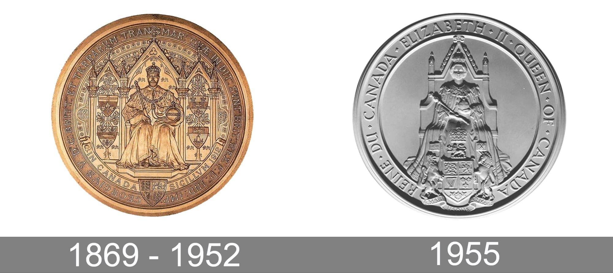
The Great Seal used during the reign of King George V also showcased the seated monarch (although, this time, this was of course not Queen Victoria but King George V). The emblems of the original provinces of Canada remained in the same places, too. Unlike its silvery predecessor, this one was golden.
1955 (Seal)
![]()
When Queen Elizabeth II ascended the throne following the death of her father, King George VI, in 1952, the old seal was destroyed, as tradition requires.
Instead, the Royal Canadian Mint produced a new seal based on the design developed by the artist Eric Aldwinckle. The seal began to be officially used in 1955.
Once again, the centerpiece of the Government of Canada logo is the figure of a seated monarch. The Queen is enthroned on the coronation chair and robed. In her hands, you can see the long-standing symbols of her status, the orb and scepter. On the forefront, the Royal Arms of Canada is positioned.
The design is by far simpler than that of the previous seals – the authors of the logo have made great strides in their attempt to make the symbolism easier to grasp. To begin with, the highly detailed background gave way to the plain solid background. As a result, the figure of the monarch has grown more prominent in comparison with the previous seals, where the details around it could have overwhelmed you.
Another step towards simplicity can be noticed in the lettering that encircles the emblem. The text in the old seals was in Latin. Conversely, this time, it is given in English and French.
Font
While the overall style of the 1955 Government of Canada logo isn’t as elaborate as that of its predecessor, it still has nothing to do with the trendy minimalistic designs you can see everywhere today. The text is set in a refined, old-school serif type. There is a pronounced variation in the widths of the strokes.
Colors
The shade of the seal is silvery, which is pretty natural if you take into consideration it is made of tempered steel.


