Godiva is a brand of chocolate manufacturer, which was established in 1926 in the USA and acquired by Turkish Yildiz in 2007. The chocolates under the Godiva label are being distributed in more than 10 thousand spots all over the world.
Meaning and history
The luxury chocolate brand, named after a noblewoman from the 11th century, Lady Godiva, uses her image in its visual identity since the first days of the brand’s history.
The Godiva logo is sleek and elegant, it is composed of a wordmark and an emblem above it. The chocolate-brown on the white color palette can gain golden shades when placed on the packaging, which makes it look even more sophisticated and high-end.
The Godiva wordmark in all capital lettering is executed in a classic sans-serif typeface with sharp angles and slightly thickened ends of the letter lines. The “Chocolatier” tagline is written in cursive in the lowercase with the first “C” capitalized.
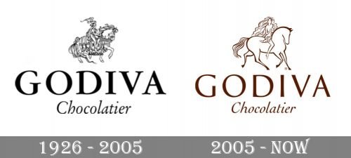
1926 – 2005

The initial Godiva badge, designed in 1926, stayed with the famous brand for almost rightly years. It was a black and white emblem with the elegant graphical part placed above the two leveled inscriptions. All the elements were drawn in black and set on a plain white background. The graphical part depicted a woman on a horse, it was drawn with lots of details in thin smooth lines. As for the logotype, executed in two lines, it had a bold and smooth uppercase “Godiva” written above an italicized “Chocolatier” in the title case with thin lines of the letters.
2005 – Present
The Godiva emblem depicts a makes Lady Godiva on the horse. According to the legend, Countess rode a horse naked through town for her husband, Earl of Mercia, to lower the taxes.
The Godiva logo is a reflection of history and the brand’s heritage. It is elegant and modest, yet is a perfect visual identity for such a luxury brand.


