Glamour is a women’s magazine published by Condé Nast Publications. Founded in 1939, it was originally called Glamour of Hollywood. Glamour is one of the biggest fashion and beauty mafia brands in the world.
Meaning and history
The history of Glamour magazine began in 1939 in the United States. At that time it was called Glamour of Hollywood and mostly wrote about the life of the Star Factory. In the 1940s there were materials about fashion and beauty, and later – about psychology, health, and life. Now the Glamour brand, which belongs to the Condé Nast publishing house, is present in 18 countries.
Today, the legendary editorial has a readership of nearly 30 million worldwide, and an increasing number of them have begun to choose the digital version of Glamour, available online.
What is Glamour?
Glamour is the name of an internationally famous magazine for women, established by Condé Nast publisher in 1939 under the name Glamour of Hollywood. Today the magazine is distributed all over the world, translated into dozens of languages, and is a number one source for fashion, beauty, and relationship information for millions of women.
2007 – 2018
 A bright pink classic sans serif masthead.
2018 – Today
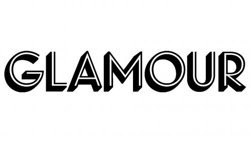
The Glamour logo wordmark has a unique style and a strong personality. It’s hard to confuse it with anything else. The wordmark features the inline shadow typeface Landmark Dimensional and is executed in monochrome palette.
The Glamour logo brings a new vibe to the women magazine field and avoids girly stereotypes. The new typeface allows the brand to have an icon for its profile pictures and applications that can be easily recognized.
The Glamour logo is very different from other women magazines and looks fantastic on the covers.
Font and Color
The solid uppercase lettering from the primary Glamour badge is set in a geometric outlined sans-serif typeface with the clean distinctive contours of the capital letters. The closest fonts to the one, used in this insignia, are, probably, Town 31 Dimensional Medium, or Shadowland JNL, but with the bodies of the letters decorated by thin white lines, coming through their middles.
As for the color palette of the Glamour visual identity, it is based on a classy and fine combination of black and white, which creates a stylish and powerful image and makes the badge timeless and actual despite the background and the placement of the logo.


