Gilera, an Italian motorcycle manufacturer, is a subsidiary of Piaggio Group. Founded in 1909, the company designs and builds motorcycles recognized for their superior quality and innovative design. With its headquarters in Pontedera, Italy, Gilera operates extensively across Europe, forging a distinguished reputation in the motorcycle industry.
Meaning and history
Gilera, founded in 1909 by Giuseppe Gilera, is a notable name in the global motorcycle industry. Based in Italy, it quickly rose to prominence for its high-performance motorcycles, even setting a world speed record in 1937. Now a subsidiary of Piaggio Group, the company has maintained a firm standing in the market, producing motorcycles that harmonize tradition with modern innovation.
What is Gilera?
Gilera is a renowned Italian motorcycle manufacturing company. It’s known for its high-quality motorcycles, combining tradition with innovation. Currently, it operates as a subsidiary of the Piaggio Group.
1926 – 1934
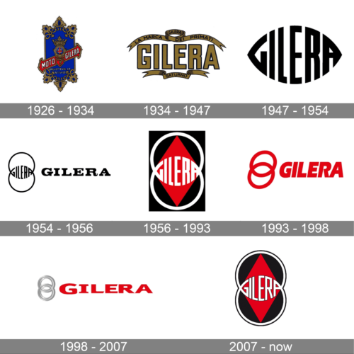
The logo of this Italian brand looks very grand and rich. It is a blue crest with an elegant golden detailed border. In the center, there was a symbol with a golden crown at the top and “Milano” printed in smaller letters at the bottom of it. A red ribbon with the company name and “Moto” printed in front of it ran diagonally across the crest
1934 – 1947
Although the logo looks sophisticated, it is nowhere close to the earlier version. The name is now the key element of the logo and is printed in a straight line using a bold, sans-serif font of a golden color with a thin black outline. Above and below the name, the emblem had wavy ribbons with inscriptions.
1947 – 1954
This logo has a form of an eye, which is formed from the name of the brand. The bold, tall, and narrow letters were adjusted in shape to create an oval shape with pointed sides. This interesting design with a strong feel was used by the company for close to seven years.
1954 – 1956
The previous emblem was enhanced by turning the eye shape into two intertwined rings. This symbol, though, was no longer the only element of the logo. It was now accompanied by the name of the company printed using a bold, serif font – EF Volta Bold. This font choice gave the logo the sophisticated feel it originally had.
1956 – 1993
The name was removed from the emblem. Instead, the designers enhanced the right symbol that was featured to the left. It was now done using thicker lines and in white. To allow it to stand out, they added a vertical black rectangle with a red rhombus in the center. Its ends almost touch the border of the rectangle. The emblem has a completely different feel with a stronger lean toward the strong and solid company.
1993 – 1998
The logo was overly simplified by preserving its bold feel and two rings. The latter no longer had an inscription in the center it was just two bold rings done in red color, which was used in earlier versions. The rings were accompanied by an inscription that was printed using an italicized, bold font without serifs. It was also done in the same shade of red that was used for the rings.
1998 – 2007
This version consists of the same elements as the previous one but in a new representation. The font used to print the name of the company has something in common with HandBlock font with different thicknesses of the strokes, serifs added to the letter “I”, and diagonal cuts in some places. The combination of bold font, wide spacing and characters, and red color create a solid and powerful brand image. Although all the letters were uppercase, the first character was slightly enlarged to create an appearance of a capital letter. The rings are no longer tilted to the right. They stand straight and have a silver color with thinner rings added on top to create interest and make them not look flat.
2007 – now
This version consists of the same elements as the previous one but in a new representation. The font used to print the name of the company has something in common with HandBlock font with different thicknesses of the strokes, serifs added to the letter “I”, and diagonal cuts in some places. The combination of bold font, wide spacing and characters, and red color create a solid and powerful brand image. Although all the letters were uppercase, the first character was slightly enlarged to create an appearance of a capital letter. The rings are no longer tilted to the right. They stand straight and have a silver color with thinner rings added on top to create interest and make them not look flat.


