Gildan is a label of sport and casual wear from Canada, which was established in 1984. Mostly known for its t-shorts, the brand also produces and distributes socks for many renowned footwear brands.
Meaning and history
Gildan is one of the world’s biggest basic apparel manufacturer, it is also a wholesaler of plain cotton clothing to other fashion brands.
The Gildan logo is composed of a wordmark with a graphical element inside. The wordmark in all capital letters is written in a custom sans-serif font with bold smooth lines.
What is Gildan?
Gildan is the name of a Canadian casual wear brand, which was established in 1984, and today is known all over the globe for its comfortable clothing, created with the use of high-quality materials. Apart from clothing, the company is specialized in the production of underwear, loungewear, and sleepwear.
1984 – 2015
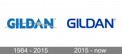
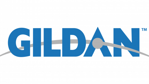
The original Gilden logo, introduced in 1984, has stayed with the company for more than thirty years. It was heavy and stable uppercase lettering in a light and pleasant shade of blue, executed in a geometric sans-serif typeface with straight cuts of the lines and right angles. The inscription was decorated by a delicate grey graphical element, which was drawn in a thick arched line across the logotype, and decorated by a solid gray circle, overlapping the negative space in the letter “A”. This element looked like an orbit and added uniqueness to the simple concept of the brand’s badge.
2015 – Today
The left corner of the letter “A” is rounded, as well as the right in the “N”, while “G” and “I” are strict and sharp and “L” has its angle softened.
The gray curved line is going through the wordmark, starting on the left, behind the lettering and coming out through the letter “A”, creating a gray circle in it.
It is an interesting and unique representation of the brand’s dynamics and value of progress and innovations. The logo is simple, yet recognizable and has an individual character.
The blue and gray color palette of the Gildan logo is a symbol of the reliable and professional brand, with its expertise in quality. It is a reflection of the company’s confidence and stability.
Font and Color
The cable and sleek uppercase lettering from the primary Gildan badge is set in a stylish modern sans-serif typeface, based on The Handel Gothic Medium font, but with some minor elements rounded. The thick lines and softened contours of the capital letters in this insignia represent the progressiveness and reliability of the company.
As for the color palette of the Gildan visual identity, it only elevates the qualities, represented by the lettering on the badge, — reliability, loyalty, and professionalism, as is based on a deep and bright shade of blue, a commonly known symbol of quality and responsibility.


