One of the world’s most famous department store chains, Macy’s has a distinctive logotype, which consists of a red five-pointed star and the company name in lowercase letters.
Meaning and history
So the bold red star appeared on the Macy’s banners in the very beginning, in the 1950s, and for the first few years, it was used along with another graphical emblem, a red cock, which later was completely forgotten.
The iconic Macy’s star logo has a very interesting history, as it was inspired by the accident, happened to the company’s founder when he was a seaman. Roland Hussey Macy got lost in the sea but the star guided him home and since then he was wearing a star tattoo, believing that it was his luck.
1920 — 1932
The Macy’s logo, used by the brand in the 1920s, was composed of a cursive black logotype, with the “R. H. Macy & Co” inscription in the upper level, and the firm’s address under it. It was a very simple yet elegant logo, very traditional for its times.
1932 — 1938
The redesign of 1932 brought a shortened and a more modern version of the visual identity, where the “Macy’s” lettering in the title-case of a stylish serif typeface was colored white and featured a black outline with a delicate black shadow.
1938 — 1948
In 1938 the brand goes more minimalist, Shang in its logotype’s typeface to a flat black inscription in a medium-weight serif font, and placing the company’s address in the same style under it. All the letters of the main inscription on this version were capitalized.
1948 — 1986
The logotype becomes bolder and the first graphical lettering appears in it in 1948. The bold five-pointed star replaced the comma between “Y” and “S”. As for the general style, the inscription was written in a title-case of a confident and solid serif font.
Along with the monochrome version the company started drawing its logo in red on white or using a reverse monochrome palette, where white lettering was placed on a black background.
1961 — 1970
Two completely different versions were adopted by the company in 1961. The first one featured an extra-bold serif inscription with all letters capitalized and a star. The second option boasted a very simple and friendly wordmark in the lowercase, written in a sans-serif font with rounded shapes and a comma instead of the star.
1970 — 1977
The redesign of 1970 made the lowercase sans-serif inscription bolder and colored in dark red. There was no symbol at all between “Y” and “S”, and all the letters were placed very close to each other, even glued.
1978 — 1982
The bold and elegant typeface was changed to a more minimalist and neat one in 1978z it was written in black again and still had no comma or star, being, probably, the most modest of all versions created for the brand during its history. Later in the same year, a more classy and traditional inscription was introduced: executed in a title-case, the serif lettering had a sleek delicate comma in it.
1982 — 2004
Two similar logotypes were in use by the company for twenty years, starting the 1980s. A lightweight sans-serif inscription in monochrome could have either a bold star or a comma between its “Y” and “S”.
2004 — 2019
The red star first appears on the official Macy’s logo in 2004. Placed on the left from the logotype, it looks bright and massive near a light and delicate sans-serif wordmark with a small black star in it. Another variant boasted an enlarged star placed above the inscription.
2019 — Today
The redesign of 2019 balanced and brightened the logo up. The star now featured the same size as all letters of the logotype, and the typeface of the inscription features thicker lines, which add confidence and strength to the whole image.
Font
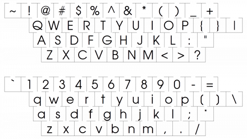
The typeface has a lot in common with the font called Avant Garde Gothic (in its Extra Light version). The geometric sans serif type was created by Herb Lubalin and Tom Carnase.


