Fenerbahce is the name of a Turkish professional football club, established in 1907. Based in Istanbul, the club playing in the Turkish Super Lig, the most reputable league in the Turkish football hierarchy, confidently kept one of the leading positions in its line-up.
Meaning and history
Fenerbahce was formed in 1907 and became the first official champion of Turkey in 1959. In the 1960s it was the most successful club in the country, winning half of the championships of the decade. In the 1970s and 1980s, Fenerbahce won four and three titles respectively. The 1990s were not very successful for Fenerbahce — they won only 1 title; but in the 2000s, Fener regained the lost positions, winning 4 titles. In the 2007/2008 season, Fenerbahce reached the quarterfinals of the Champions League, which is the highest achievement in the history of the club in the international arena.
What is Fenerbahce?
Fenerbahce is a Turkish football club, playing in the Turkish Super League. Home matches are played at the Sükru Saracoglu Stadium in Istanbul with a capacity of 50 thousand seats. In addition to the soccer club, the Fenerbahce Sports Club includes men’s and women’s volleyball and basketball clubs, track and field, boxing, rowing, and sailing divisions.
The difficult name of the Turkish football club, Fenerbahce, has a pretty simple explanation: “Fener” means “Lighthouse” and “Bahçe” can be translated as “Garden”. Fenerbahçe is also a park in the Asian part of Istanbul, and the club is located next to it.
The first emblem appeared in the year the club was officially founded. The lighthouse located on the Fenerbahce Cape had a big influence on the design of the first emblem of the club, which used yellow and white colors of daffodils growing around the lighthouse. The uniform was also designed with yellow and white stripes.
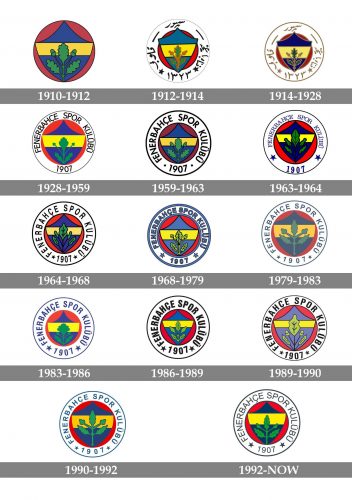
1910 — 1912
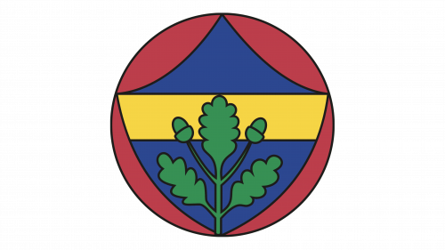
The idea of the original Fenerbahce soccer club emblem came to one of the club’s players Topuz Hikmet and was brought to life by Tofik Hakkar. It was an elegant and sharp blue crest with a wide yellow stripe on it. The crest was set on a solid red circle and was decorated by the drawing of three green oak branches with three leaves and two acorns.
Each color in the palette of the logo has its meaning. Thus, the red circle is a tribute to the Turkish flag and love for the homeland. The yellow stripe symbolizes respect from opponents and the blue color of the crest symbolizes nobility. The oak branch is a symbol of power, and its green color stands for success and growth.
1912 — 1914
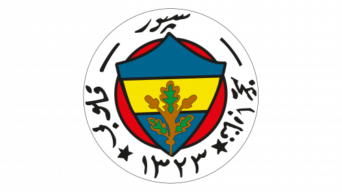
The redesign of 1912 added a wide white frame, where the circular inscription with the club’s full name in Arabic was written. The white color here symbolizes purity and goodwill. Apart from this addition, a few more changes were made to the badge. The crest was enlarged and outlined in black, as well as the yellow stripe. As for the oak leaves — they changed the color to brown and green, looking calmer and stricter now.
1914 — 1928
In 1914 the Fenerbahce logo was refined again. The Arabic lettering turned dark gold, and the lines of the letters became smoother. The black outline on the crest was also replaced by the gold lines, and the blue and yellow shades got deeper and brighter. The oak branch was redrawn, becoming more detailed and elegant, in dark green, with a bold golden outline.
1928 — 1959
In 1928 logo of the Fenerbahce football club underwent a significant change: the Arabic inscription was replaced by the Latin script, which happened after Turkey adopted the new alphabet. The new inscription was set in black capitals of a simple sans-serif typeface, with the “1907” datemark at the bottom of the badge. As for the main part of the logo, it was refined again, having all the outlines removed, and intensifying the color contrast of the elements.
1959 — 1963
The redesign of 1959 introduced a more intense and dramatic version of the Fenerbahce logo. The white frame got wider, making the central circle smaller. The bold black outline was balanced by the bold lettering with the datemark, written along with the frame. As for the central element, the red color on it became burgundy, and the blue crest with the yellow stripe also got additional black lines.
1963 — 1964
In 1963 the lettering on the frame became blue, and changed its typeface to an elegant serif, with the capital letters placed very close to each other. The solid dots around the datemark were replaced by two large five-pointed stars in blue. The central element was also redesigned: the scarlet red background was back, and the green oak branch now featured gives green leaves.
1964 — 1968
The redesign of 1964 brought back the black color mod the lettering and its sans-serif typeface, though now the letters were taller and had more space in between. The central part remained almost untouched, with just a slight refinement of the shades. The green oak leaves became smoother and calmer, with the red intensified and made deeper.
1968 — 1979
The deep blue color was changed to a calm light blue after the redesign of the Fenerbahce logo in 1968. Now the white frame boasted a thick blue outline from both sides, and the lettering written around the perimeter of the frame was executed in the same shade, with each of the bold sans-serif capitals gently outlined in black. The crest also got lighter, along with the red of the background, and the lovely green oak, which got its original composition of three leaves and two acorns back.
1979 — 1983
The new badge of the Fenerbahce football club was executed in a new dusted color palette and got the oak’s leaves enlarged, taking all space on the crest with a yellow stripe. The frame got thinner, so did the lettering, and the new typeface worked really well with the balanced spacing between the letters, creating a modern and stable visual identity for the Turkish sports club.
1983 — 1986
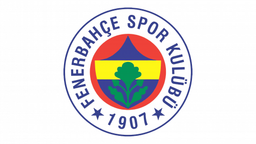
The white area of the logo became wider, hence the height of the letters in the inscription also increased. The new shade of blue was brighter and more intense, and the oak leaves were redrawn, so now only took ¾ of the crest. Though the yellow stripe on the crest became wider too, and the top blue part was elongated and sharpened, having the sides arched to the center.
1986 — 1989
The shape of the crest became more geometric and almost straight in 1986. The outline and logotype on the badge turned black again, and the new typeface showed even bolder and heavier letters than on the previous versions of the logo. Now there was no space left between the name of the club, the two black stars, and the “1907” datemark. The plant on the crest was redrawn more delicately, with tender green leaves gaining a thin black outline.
1989 — 1990
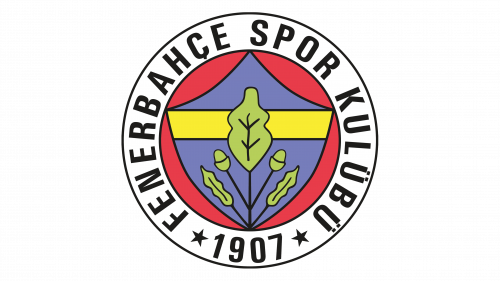
The redesign of 1989 made the white framing of the badge a bit thinner and enlarged the oaks’ leaves on the crest again. The color palette got muted, with the black lettering getting all the attention, due to a strong contrast with the white background. Overall the composition of the badge remained untouched, but as usual, the contours of all elements were a hit rethought and retouched.
1990 — 1992
The oak leaves become the central element of the Fenerbahce badge, getting enlarged and redrawn in a brought green shade with a blue outline. The frame and lettering of the circular medallion of the Turkish football club became calm blue, and the size of the letters was better balanced now, while the two stars (also in blue) became very small and delicate.
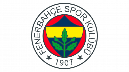
1992 — Today
The redesign of 1992 introduced a completely new shade for the framing and lettering of the Fenerbahce logo — to gray. The lettering and stars were redrawn and balanced, with clean strong contours, and modern shapes. The colorful roundel in the center got its colors deepened, and started looking truly professional and exquisite. The oak got its normal size, but due to the vivid shade of green used for it in this version, it was still the first element on the badge to be noticed.


