Frasers Group is the parent company of GAME, a leading retailer in the video game industry. The company, under the ownership of British entrepreneur Mike Ashley, specializes in the sale of video games, consoles, and related accessories. GAME operates primarily in the United Kingdom, where it maintains a significant presence with numerous retail locations across the country. This strategic distribution allows them to serve a wide demographic of gamers and enthusiasts, ensuring accessibility and variety in their product offerings.
Meaning and history
GAME was founded as a small video game retailer and has since grown into a prominent part of the Frasers Group. Originally established to cater to the burgeoning market of video gamers, GAME quickly expanded its reach by opening stores in prime retail locations. Over the years, the company has achieved numerous milestones, including surviving the competitive shifts in the retail landscape and adapting to the digital transformation in gaming. Their ability to offer exclusive limited edition games and early releases has set them apart in the industry.
Currently, GAME continues to thrive under the Frasers Group umbrella, contributing significantly to its parent company’s revenue. The retailer has embraced the online marketplace, enhancing its e-commerce platforms to meet the changing preferences of consumers. This strategic move has not only sustained its relevance but has also positioned GAME as a forward-thinking player in the digital era, ready to meet future challenges in the gaming industry.
What is GAME?
It is a prominent game retailer owned by Frasers Group, specializing in video games, consoles, and accessories. Primarily operating in the UK, GAME offers both physical and online shopping experiences, adapting well to industry trends and consumer preferences.
1984 – 1993
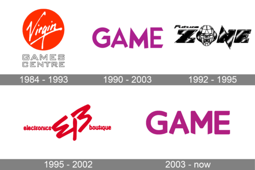
The first logo is a rendition of the Virgin Games Centre. It features the iconic “Virgin” wordmark in a signature, cursive font that is suggestive of personal touch and dynamism. The script is white set against a red circular background, often associated with Virgin Group’s branding, which conveys passion, energy, and attention-grabbing prominence. Below this, “GAMES CENTRE” is spelled out in bold, capital letters with a modern, sans-serif typeface that contrasts the fluidity of “Virgin,” emphasizing stability and a direct approach. The overall look is striking and balanced, successfully marrying the personal flair of the Virgin brand with the straightforwardness of gaming retail.
1992 – 1995
The logo showcases the brand “GAME” in a solid, uppercase font interrupted by horizontal lines, giving it a digital, glitch-like effect. This design is likely intended to reflect the digital and electronic nature of video games. The use of a single purple shade adds to the contemporary aesthetic, suggesting creativity and imagination, which are vital components of gaming. The ‘glitch’ implies dynamism and movement, or it may refer to the digital world where these games exist.
1995 – 2002
This logo appears to be a minimalist design, primarily utilizing a stark black color. It features a bold, sans-serif typeface that conveys a modern and straightforward aesthetic. The letters are arranged in a slightly staggered formation, creating a dynamic sense of movement. This arrangement, along with the absence of additional graphics or embellishments, suggests a focus on clarity and efficiency. The capitalization of the word “ZONE” emphasizes the importance or dominance of the name, which could be indicative of the brand’s confidence in its industry related to entertainment, retail, or technology.
1990 – 2003
For the logo, the design takes on a more complex and vibrant appearance, with a vivid red color dominating the visuals. The typography is more stylized, with varied letter sizes and bold, italicized characters that give off an impression of speed and excitement. This design choice is intended to evoke energy and passion, which are often associated with gaming or dynamic consumer experiences. The texture within the letters adds depth and contemporary touch that the entity it represents is at the forefront of its field, innovative.
2003 – Today
The current logo presents a playful and inviting image through its use of a bright, magenta hue. The rounded, sans-serif typography contributes to a friendly and accessible vibe. Unlike the previous logos, this one includes a clear, all-caps treatment of the word “GAME,” which, alongside the color choice, might be intended to attract a youthful audience or convey a sense of fun and excitement. The simplicity of the design, devoid of any additional graphic elements, allows the name to stand out that the brand it represents is confident in its recognition and status in the entertainment, gaming, or leisure sectors.


