The Neopets website offers its users to own a virtual pet and buy virtual items for it.
Meaning and history
The brand was introduced in the winter of 1999 by Adam Powell and Donna Williams. Since then, it has gone through several owners. Nevertheless, the Neopets logo hasn’t changed much.
1999 – 2020 (primary)
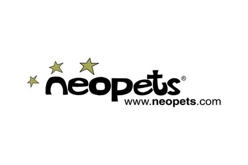
The old wordmark already showcases the familiar type with rounded glyphs. The “n” has lost its top end, which made it look like an arch. The “p” echoes the shape of the “n,” although it does hold a couple of acute angles.
Apart from the rounded shapes, which are associated with friendliness, the wordmark also focuses on casual style. This, in its turn, helps to create a playful and relaxed atmosphere.
There are three stars above creating an illusion of motion. The illusion is created by the size of the stars (they are going from the smallest to the largest one thus directing your gaze) and by the color (ranges from the lighter shade, which makes the star look as if it were far away, to the more saturated one).
2020 – now
Designers redrew the primary logo without changing its essence.
While at first glance, the letters may look the same, in fact, the shape of all of them has been slightly modified. They have grown neater, more consistent. The acute angles on the “p,” which could be seen in the previous version, have been rounded, to better fit the other letters.
The ends of some glyphs were rounded (note, for instance, the “s”). Also, the letters appear somewhat plumper. Both of these alterations contribute to a friendlier mood.
The stars have grown brighter. This is partly due to the fact that the grayish-yellow was replaced by a more vivid tint. Also, the “blurred” effect disappeared. Not only did this make the stars more eye-catching, but also reduced the dynamism of the logo. Now, only the size of the stars supports the implied motion.
While the emblem described above is used as the primary one, the old logo is still in use as an alternative version.
Font
The custom script creates a unique style making the Neopets logo stand out. It conveys a positive, laid-back, and inviting feeling due to the rounded shapes and rather plump strokes.
Colors
While the majority of the surface is occupied by black and white, the yellow creates a bright accent that helps to jazz up the whole design.


