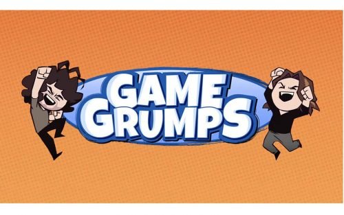
Game Grumps is a Let’s Play web series. As of late 2020, there are over 6,700 episodes. In the series, co-hosts Dan Avidan and Arin Hanson play video games adding comic remarks. The project works under the multi-channel network JETPAK created by Adam Montoya.
Meaning and history
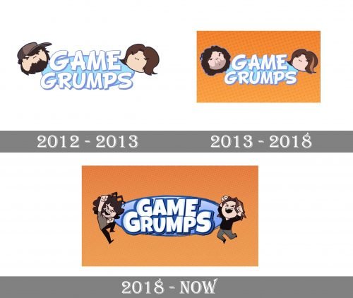
The Game Grumps logo has preserved its style and mood throughout the years. And yet, there has been a couple of slight updates in the design.
2012
The game was introduced by co-hosts Arin Hanson and Jon Jafari. The original logo showcased the caricatures of the co-hosts (only the heads).
Between them, there was the name of the game in large white letters with light blue trim. The glyphs had a casual, relaxed, and fun style. They were rather heavy and had a somewhat irregular shape as if they had been casually drawn by hand with bold strokes.
Behind the wordmark, there was a shape in light blue with the border of the same hue as the border of the letters.
2013
Jafari left the show in 2013 to work on JonTron, his YouTube web series. He was succeeded by Dan Avidan. Of course, the Game Grumps logo reflected these changes.
While the wordmark remained the same, the caricatures were updated – you could now see Avidan’s caricature on the left. Also, Hanson on the logo updated his hairstyle (as he did in real life).
2018
The brand updated its logo without dramatically changing its style. The blue of the shades around the letters grew darker. Also, the shades grew bolder. Together with the barely noticeable bluish highlights on the letters, this added some depth.
The shape in the background has grown larger. While on the previous logo almost all the letters were partly outside the shape, it was different now. Almost all the letters are inside the shape with only the “G” and “S” going slightly beyond its border.
The hue of the light blue filling of the oval shape has grown more transparent and was enriched by the gradient.
The caricatures of Dan Avidan and Arin Hanson are still there. This time, the authors of the logo change the way the caricatures look now and then. Both the co-hosts are shown in full height and adopt various positions.
Font
Ever since the first logo was introduced, it has featured custom typography. The letters have always looked casual and irregular. Yet, in the current version, the glyphs are plumper than in the original one. There are fewer “unnecessary” strokes (like the too-long bar of the “A” or the “E” from the original version).
Colors
Both the old Game Grumps logo and the current one are built on the principle of complementary colors. In contrast to the brown and beige tones of the Avidan’s and Hanson’s clothes, faces, and hair, the blue tones of the wordmark appear more saturated.


