Funimation Productions, LLC, is an entertainment company based in Flower Mound, Texas. It focuses on the dubbing and distribution of East Asian media, including Japanese anime.
For much of its history, the Funimation logo was based on the combination of geometrical shapes inspired by an exclamation mark.
Meaning and history
Funimation Productions is an American company that specializes in dubbing, streaming, and distributing foreign content, primarily Japanese anime series based on manga, games, and novels of the same culture. The company, established in 1994, has given fans of Japanese animation a huge number of projects.
During its history, Funimation has released such amazing projects as Dragon Ball, My Hero Academy, Fullmetal Alchemist: Brotherhood, Attack in Titans, and many many others. My Hero Academy is one of the most popular anime series in the world. The show tells the story of Izuku, who was born in a world where almost all the inhabitants possess some kind of superpower.
What is Funimation?
Funimation is the name of a defunct American entertainment company, which was established in 1994 and ceased all operations in 2022. The studio was based in Texas and got popular due to such projects as My Hero Academia, Tokyo Ghoul, Dragon Ball, and many others.
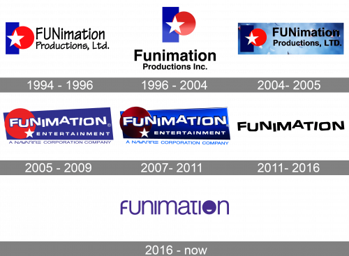
1994 – 1996 (Funimation Productions)
The original logo combined three shapes: a white star (on the forefront), a larger red circle (behind the star), and a blue rectangle (behind the circle). During the earliest period of the company’s history, the square was standing on its narrow side, while the company name could be seen next to it.
In the 1994 version, the lettering featured a somewhat playful type and was placed to the right of the emblem.
1996 – 2004
The typeface grew straighter and more “serious.” The name of the company was typically placed below the geometrical emblem, although you could still come across a version where it stayed in its previous place. In this case, shades were added, which made the design different from the 1994 logo.
2004 – 2005
The position of the shapes forming the emblem and their size slightly changed. So, while the overall look of the emblem might have preserved pretty much the same, you could feel it had been refreshed.
Another important update was that the text grew larger in comparison with the pictorial part of the logo – it now occupied more space.
2005 – 2009 (Funimation Entertainment)
The design team preserved the original three shapes but gave them a much more playful and fun look. The rectangle was replaced by an irregular quadrilateral. It now stood on one of its longer sides, due to which it was possible to place the name of the company inside, not next to the emblem.
While the red circle was preserved rather large, the white star grew by far smaller. The “serious” type was replaced by something that better fitted the word “fun” in the company’s name.
2007 – 2011
The gradient that was added to the design created a 3D effect.
2011 – 2016
The geometric emblem disappeared leaving only the word “Funimation.” The type remained unchanged. A large “F” appeared below the writing.
2016 – Today
 The Funimation logo went through a complete overhaul. Many of the angles on the letters were rounded. The type grew lighter. The “o” was replaced by a “smiling” circle.
Font and Color
The custom medium-right lettering from the primary Funimation logo is set in a slightly narrowed sans-serif typeface with some design elements, making the wordmark look unique and memorable. The closest fonts to the one, used in this insignia, are, probably, Nura Light, or Neue Haas Grotesk Display 55 Roman, but with some delicate modifications of the characters’ contours.
The color palette of the Funimation visual identity is based on a calm yet the intense shade of purple, a color, that stands for creativity and imagination. In combination with white, purple looks sleek and professional, pointing to the best qualities of the company and showing its strong values.


