Friends are the name of one of the world’s most famous series, which was launched in 1994 in the United States. The plot of the series is built around six friends, who live in New York City. The sitcom became extremely popular not only in the USA but all over the globe.
Meaning and history
The visual identity of the iconic sitcom was designed in 1994 and has never been changed. Its logotype became as significant as the series itself in the history of contemporary cinematography.
1994 – 2004
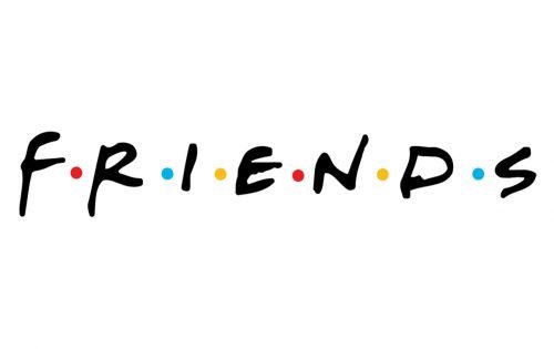
The Friends emblem was designed by Deborah Naysee, and despite it was created in 1994, today it still looks trendy and sleek. The logo is based on a custom black inscription with six colorful dots between the letters. The dots in the composition symbolize six friends, the main characters of the sitcom.
The black bold letters of the logotype are smooth and soft, looking like they were handwritten and evoking a very welcoming and friendly mood, brilliantly reflecting the essence and character of the series.
The bright details of the logo represent brightness and fun, energy and love of the Friends’ characters, adding freshness and edginess to the overall composition and making the simple and laconic logo eye-catching and memorable.
2019
The Friends logo was redesigned just once, in 2019, to celebrate the 25th anniversary of the most popular sitcom on American Television. The refreshed version got its letters refined and cleaned, the colorful dots changed their order and the ornate and fancy framing was placed above the logotype.
The vertically oriented white rectangle in a double black and yellow outline was enclosed in an ornate frame, composed of four curved lines with vignettes in their ends. The lines are executed in the same black and yellow palette as the rectangular outline.
In the middle of the emblem, the “25 Years” inscription is placed, with the numbers set in bold red lines, and the letters written in delicate black under them.
Font and color
The instantly recognizable Friends logotype is executed in a custom bold typeface, which is called Gabriel Weiss’ Friends, but it also looks pretty close to such fonts as Black Racer Regular, Fave Hand Pro, and NorB Croquis, which also look kind, smooth, and very “homey”.
The strict black lettering of the Friends visual identity is accompanied by two pink, two blue, and two yellow dots, which are placed between the letters and add crispiness, style, and mood to the logo. Pink is a commonly known symbol of love, warmth, and passion, while light blue stands for loyalty, reliability, and confidence. Yellow dots symbolize friendship itself, along with energy, creativity, and a sense of humor.
The color palette of the sitcom’s emblem is perfectly balanced and looks timeless and elegant despite its thick and slightly amateurish hand-drawn lines and shapes. The delicate colorful accents represent the essence of the series and evoke nothing but very warm feelings.
What do the dots mean in the Friends logo?
The six colorful dots in the logo of the popular Friends series stand for the number of friends, and the main heroes of the show and the different colors of the dots show their different personalities. The dots are placed between the uppercase handwritten characters of the logotype, making the badge look lighter and more playful.
Are Friends copyrighted?
All of the graphical elements of the Friends visual identity, as well as the name of the series, and all the materials and creations, designed for it, are copyrighted, so to use any of the logos or icons of the Friends brand you need permission.
What color are the dots in the Friends logo?
The six dots on the logo of the Friends are set in three colors, with one shade for a pair of dots. This concept was used by the designers to represent the main characters of the series, and show their difference (three colors), and similarities (three pairs). Pink dots stand for women, blue — is for men, and yellow is a symbol of warmth and friendship.
Who created the Friends logo?
The Friends logo was created by Deborah Nayee in 1994 and has never been redesigned since its introduction, as there is nothing in the badge at all, that has to be changed. The Friends logo is considered to be one of the best badges in history.


