

![]() Forza Horizon Logo PNG
Forza Horizon Logo PNG
Forza Horizon is the name of a video game created for Xbox in 2012. The racing simulator has released four volumes by today, available in two different modes (single- and multi-player).
Meaning and history
![]()
The visual identity of the racing video-game looks trendy and strong. Composed of three main elements, the Forza Horizon logo is well-balanced and solid, and all the parts can easily be used on its own, keeping the unique character and recognizability.
The Forza Horizon logo comprises the main wordmark in black, with a bold emblem on its left and a colorful banner with another lettering under it. The “Forza” inscription features a bigger size of its capitals and is executed in a sleek modern sans-serried typeface with distinct lines and angles. The font is very similar to the famous ITC Blair Pro Bold.
The “Horizon” part of the wordmark uses another kind of font, which is also a sans-serif, but narrowed and italicized. The typeface of this part is close to Florida Serial Heavy Italic and Klein Condensed ExtraBold Italic fonts.
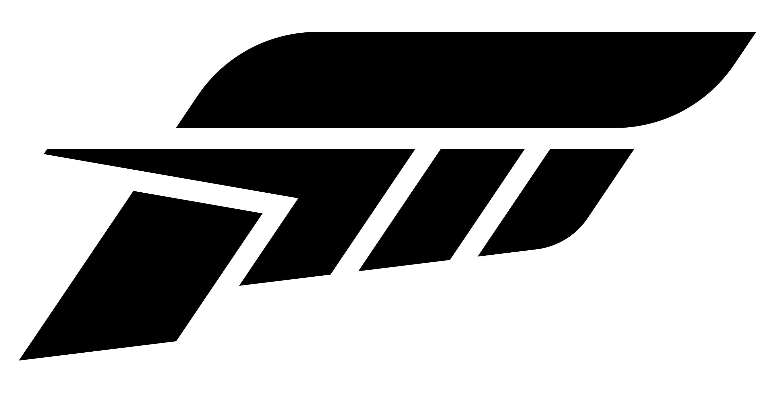
The most remarkable element of the game’s visual identity is its emblem. The smooth and sleek stylized letter “F” looks like a badge on a luxury sports car, which brilliantly represents the purpose of Forza Horizon.
As for the color palette, it is composed of three main shades — black, white, and pink. The monochrome part alternates between black lettering on a white background and a white inscription with an emblem placed inside a black horizontal rectangular. The bottom part of the emblem features a white nameplate on a bright pink rectangular banner, which gains a gradient orange shade on the 4th version of the game.


