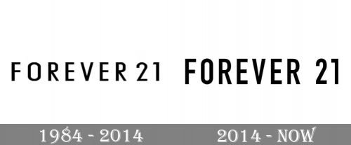
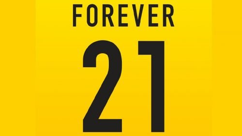
The Forever 21 logo has been remarkably consistent throughout its more than 45-year history. There has been only a single update, which was pretty subtle and did not affect the overall style of the design.
Meaning and history
Forever 21 started in Los Angeles in 1984. The name of the first store was Fashion 21. At its height, the company boasted a chain of 700 stores. In the fall of 2019, the brand filed for bankruptcy protection.
1984 – 2014
The original design looked pretty much like the current one. There is every chance you would not have noticed the difference between them unless you compared the two versions side by side.
The old logo featured the lettering “Forever 21” in a simple sans serif typeface. The proportions of the letters were somewhat distorted in comparison with the majority of the widely used, traditional types like Helvetica, Arial, and Times New Roman: the glyphs looked tall and narrow.
The ends of the letters were not rounded. In most cases, they looked pretty generic, except maybe for the number “1”: here, the top end was cut diagonally.
Another distinctive feature was the length of the horizontal bars forming the letters “F” and “E”: all of them had the same length.
2014 – Today
While working at the modification of the logo, the design team was determined to save the brand’s visual legacy. Although the wordmark did not change that much, it grew slightly more professional.
To begin with, all the letters put on some weight. Due to this, the updated wordmark became better legible even at smaller sizes or from large distances.
Also, the width of some of the letters changed. Most notably, the “O” grew narrower. As a result, it now looked more like it belonged to the same type as the letters next to it, while in the previous logo it appeared a bit too wide.
The horizontal bars in the middle of the “F” and “E’s” grew somewhat shorter.
The diagonal bars of the “R’s” started at a slightly different point than in the previous logo. Also, while the top end of the “1” on the old logo was cut diagonally, it now featured a square angle.
To sum up, the updated design solved several issues its predecessor had without changing the overall style.
Colors
Like most logotypes of fashion companies, the primary version of the Forever 21 logo is black over the white background. The approach gives the company some freedom in terms of placing the design over varying backgrounds and visual context.


