Ferrero Rocher is a brand of chocolates, created by Ferrero Group in 1982. Named after the rock, candies are spherical and have 4 different layers around a hazelnut.
Meaning and history
The Italian chocolatier Ferrero was established in 1946 but it was only in 1982 that it introduced its premium brand Ferrero Rocher.
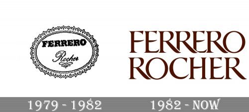
1979 – 1982

The logo, designed for the famous chocolate brand in 1979 featured a very elegant badge in an ornate oval framing. The lettering inside the frame was executed in two different styles — the upper “Ferrero” in extra-bold capitals of a classy serif font, and the bottom line with “Rocher” in delicate cursive, underlined by a vignette.
1982 – Present

The redesign of 1982 brought a new style of the logo to the iconic brand, and it still stays with Ferrero Rocher today. The capitalized inscription in a custom serif tour face with elongated and pointed tails of some letters is executed in warm brown color and can be placed on a white or gold background, depending on the needs.
Font and color
The custom elegant serif typeface of the Ferrero Rocher visual identity is very close to such fonts as Shango Bold and Anavio Small Capitals Bold, but with some lines emboldened and modified. On the upper part of the logo, the two letters “R” overlap each other, while on the bottom — all letters have space between each other, and this is what adds even more sophistication and individuality to the iconic logotype.
The warm brown color of the Ferrero Rocher lettering first of all represents the purpose and essence of the brand — chocolate. It also makes the brand look chic and luxurious, evoking a sense of high quality, the value of flavor, and beauty.


