Family Guy is an animated sitcom made by Seth MacFarlane for the Fox Broadcasting Company. It showcases the Griffins family living in a fictional city of Quahog, Rhode Island.
Meaning and history
Seth Woodbury MacFarlane, who is today known as an actor, animator, writer, and producer, conceived the sitcom in 1995, during his student years at the Rhode Island School of Design. He made a thesis film named The Life of Larry and a sequel to it. The Family Guy, in its turn, was based on the characters from these early works.
1998 (logo for the pilot)
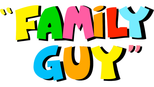
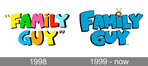
In the spring of 1998, MacFarlane introduced the pilot of his sitcom to Fox. It featured the first version of the Family Guy logo. While it looked pretty different from the current one, you can already notice quite a few similarities.
To begin with, the very shape of the letters – plump, stout, somewhat rounded – resemble the figures of the main characters of Family Guy (especially the males from the Griffin family). On the pilot logo, this similarity is emphasized by using various colors for each letter. As a result, each glyph becomes a cartoon character “dressed up” in the “clothes” of a certain color.
Also, there were quotation marks on each side of the name of the cartoon. Like the letters, they were colored in different shades.
The original colorful logo was shown on the dark blue background. The parts closer to the sides were darker, while the central part was lighter. Due to this, the writing seemed to have been emphasized by the limelight.
1999
The Fox executives liked the short demo and decided to order thirteen episodes of Family Guy to air in midseason. This time, the animated series appeared with an updated logo, which looked calmer without sacrificing its meaning.
This time, all the glyphs were of a single color, light blue. There were also subtle black shades, to add some depth.
The style of the glyphs remained consistent despite a couple of modifications. The letters became slightly more rounded and bold (look, for instance, at the “F” and “Y”). While the letters in the pilot Family Guy logo were of almost the same height, the primary logo used a different approach. Here, the initial “F” was capitalized, while the “G” was slightly larger than the following “U.”
Also, there was less breathing space between the glyphs. This could be explained by the fact that the letters grew heavier.
Another distinctive alteration was the introduction of the TV set. It was positioned above the “i” replacing the generic dot.
Eventually, the designers removed the quotation marks. This made the logo simpler and more effective without any damage to the meaning.
Colors
The light blue dominating the Family Guy logo is rather saturated. It is close to the shade of the sky on a clear and hot summer day. The color creates an optimistic impression. We can assume that blue, as the color associated with loyalty, fits the name “Family guy” very well.


