Gacha Life is the name of a video game, released in 2018 by Lunime, a famous game developer from the USA. The anime game is available for mobile devices on Android and iOS and the computer. Gacha Life is a game labeled 9+, which makes it easy to determine that the main audience is school-age children.
Meaning and history
In Gacha Life you can create your own characters, make videos (something in between navies and animation), and put it in the public eye, namely – on YouTube and TikTok, which most do. Today, you can find millions of videos created in this game.
One of the most appealing features for children with a rich imagination is the module for creating your character, where you can pick out his clothes and edit his appearance. Then the character moves either to “Life” mode, where there are about a hundred NPCs or to “Studio”, where you select the scenery for the animations. The desired location is easy to equip with dozens of items placed in a special tab, as well as choose any background.
As you can see, the game offers a lot of tools and possibilities for creating colorful and cool videos, which you and your friends will be enjoying to watch. But what about the visual identity of the game itself? The badge is bright yet pretty modest in terms of composition, which is understandable, as the developers wanted to keep all the extra features in-game.
2018 Unused
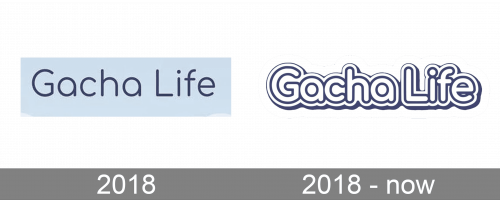
The very first logo for the game was created while Gacha Life was on its initial stage, before the release, so actually, it has never been used on any official material. The badge featured a title case logotype in a lightweight rounded sans-serif typeface, with dark blue letters set on a solid sky-blue background. It looked fresh and light, evoking a friendly and pleasant feeling.
2018 – Today
The official logo was created for the game a few months later, with the official release. The developers decided to keep the blue color palette but made an addition to it — light pink shades. The logotype was now gradient pink-to-blue, with its bold rounded sans-serif letters (also in the title case) outlined in dark blue and placed on a white badge, which had its frame repeating the contours of the inscription. This made it possible to place the badge on any background without losing its brightness and recognizability.


