Fakro is a Polish company, specializing in the design and manufacturing of roof windows. By today the company became the world’s leader in its segment and has its products distributed all over the globe. The group has more than 4 thousand employees and 12 production sites worldwide.
Meaning and history
The group’s visual identity is minimalist and simple, yet instantly recognizable and evoking a sense of professionalism and quality.
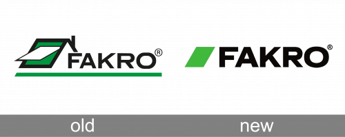
The logo of the company is composed of a wordmark with an emblem on its left. The current emblem is fully based on the previous visual identity design — where the symbol depicted on the opened roof window, executed in green white and black color palette.
The Fakro logo from today features a minimalist and laconic geometric icon, which repeats the contours of the original emblem — a clean and neat green parallelogram. It represents the essence and nature of the company, emphasizing on its stability and confidence.
The green and black color palette of the company’s visual identity if a reflection of progressive approach and energy, along with the authority and professionalism of the group, that is constantly developing and growing.
What is Fakro?
Fakro is the name of a Polish family-owned company, which was established in 1991, and is specialized in the production of skylights and roof windows. Today the company operates internationally, with 12 production plants and 17 representative offices worldwide.
Old Logo
The original Fakro logo, used by the company since its first years, was composed of a stylized graphical emblem in green, white, and black, and a bold uppercase logotype in plain black, set on its right. The emblem featured a drawing of an open roof window, with a green background, supported by a thick green underline of the whole badge. The left diagonal line of the emblem was triangularly bent to the right, making up a minimalistic contour of a roof.
New Logo
After the redesign, the Fakro badge kept its green and black color palette and the diagonal placement of the emblem but got both elements rethought and minimized. The new emblem is just a solid green parallelogram with no additional details, while the lettering is now set in a bold clean sans-serif font with distinctive contours and heavy bars. The underline was completely removed from the Fakro logo.
Font
The black nameplate in all capitals is executed in a strong and bold sans-serif typeface, which is similar to Sequel 100 and Remora Corp fonts, but with the letter “F” modified — its bottom horizontal bar slightly shortened.
The bold strict lines of the typeface evoke a sense of a serious company, which values traditional and heritage yet aims to develop new products in order to satisfy all the possible needs of its customers.
Review
FAKRO is a private company, which takes the leading position in the world’s market of roof windows. Besides the windows, the company also manufactures various accessories, electronic controllers and loft ladders.
The company became popular worldwide very fast, due to its strong Research team, which develops new technologies and has over 100 patents by now. Today the company has its subsidiaries and operating offices almost on all the continents and supplies the latest products to architects, designers and construction companies across the globe.
The company has a wide range of window solutions, suitable for all the possible interiors and customer’s needs. The company also provides consulting and installation services to its clients.


