The Northrop Grumman logo looks serious and business-like but it does not seem to convey the message the company wants it to.
Meaning and history
Northrop Grumman Corporation is an American military-industrial company headquartered in West Falls, Virginia (USA). Founded in 1994, it offers a wide range of aerospace and military capabilities and technologies. Participates in many priority defense and government programs in the U.S. and abroad. Conducts the majority of its business with the U.S. government, primarily with the Department of Defense and the intelligence community, as well as with foreign clients.
The company was originally founded in 1939 as Northrop Aircraft Incorporated, but after many acquisitions and mergers, particularly with Grumman Corporation in 1994, was renamed Northrop Grumman.
What is Northrop Grumman?
Northrop Grumman is one of the leading U.S. defense companies and one of the world’s major manufacturers of combat aircraft. The company was founded in the United States in 1994 as a result of a merger between Northrop Corporation and Grumman Corporation.
1994
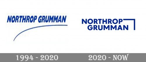
The original logo featured the lettering “Northrop Grumman” in a heavy sans serif type. The letters were strongly italicized, which apparently was supposed to double the dynamism of the design. The stroke below the wordmark was also intended to serve the same purpose. It could be interpreted as a trajectory of a plane flying up in the sky.
However, the difference in the thickness of the line and its shape did not let the two elements of the design blend into a single image. Each of them looked like two independent emblems rather than parts of a single whole.
2020
The disproportion in the weight and shape of the two parts of the logo has been partly resolved in the updated logo. This time, the thickness of the lines forming the emblem is closer to the thickness of the letters. Also, the emblem features a straight angle making it rhyme with the rectangular letters. The exaggerated italics have disappeared.
On the downside, the type in the Northrop Grumman logo looks pretty generic and does not seem to convey any important message. By the way, the type is Futura Maxi, with the customized squared-off double “M.”
According to the company’s official website, the angular emblem is the “Forward Mark,” which is supposed to symbolize their “determination to continuously lead the way.” It has been inspired by the periodic table of elements. In addition to these, the emblem is also supposed to reflect the company’s place “at the forefront of technology and innovation.” And yet, if you try to trace the dynamics of this shape, you will hardly find it is moving forward – it leads either backward or down.
Font and Color
The bold geometric lettering from the primary Northrop Grumman logo is set in the uppercase of a modern sans-serif font with the clean distinctive contours of the characters. The closest fonts to the one, used in this insignia, are, probably, Futura Maxi Pro Bold or Tafel Sans BC Bold, but with some minor modifications.
As for the color palette of the Northrop Grumman visual identity, it is based on a dark yet bright shade of blue, a color of professionalism, stability, and determination. The blue lettering with the geometric element is set against a white background, creating a strong contrast and an eye-catching image.


