

![]() Fairtrade Logo PNG
Fairtrade Logo PNG
When a product carries the International Fairtrade Certification Mark, it means that all the ingredients have been produced according to Fairtrade political standards. The mark is used in over 50 countries.
Meaning and history
![]()
Throughout the history of the Fairtrade movement, quite a few individual national Marks were used until in 2002 the blue and green Fairtrade logo was adopted, which was to be used as the only official symbol all around the world.
Mark emblem
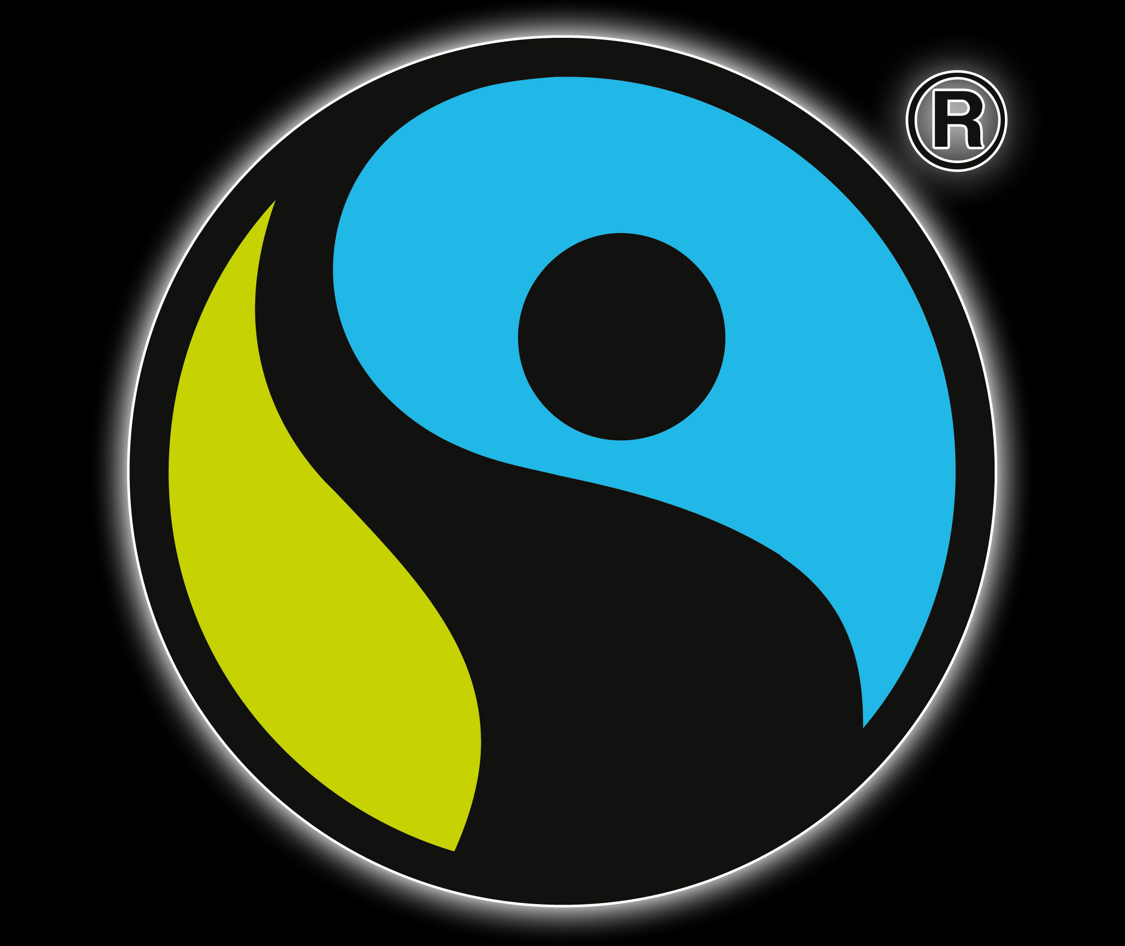
The current roundel has definitely a lot in common with the ancient Chinese Yin and Yang symbol. The blue part of the circle actually looks like a half of the Yin and Yang symbol, while the green and black parts of the circle have a bit different shape somewhat similar to the Pepsi logo.
Program symbol

In 2014, the movement introduced its Fairtrade Program symbol. Although it is based on the same roundel, the overall design is different. The word “Fairtrade” in black is placed on the right. Below, there is the blue lettering explaining what type of program the logo refers to (“Cocoa Program”, “Sugar Program” etc.).
Font
![]()
The clear, traditional sans serif typeface used on the Fairtrade logo looks very much like Rostis Sans Serif and Transit fonts.
Color
![]()
Both the Fairtrade Mark and the Fairtrade Program Mark combine light blue, light olive green, white, and black. However, the proportions of black and white are different, so the visual impression is different, too: in case of the Fairtrade Mark, black is the king, while on the Fairtrade Program Mark white dominates.


