Fairtex is a brand of martial arts apparel, established in 1958 in Thailand. The brand is best known for the design and production of boxing and Muay Thai equipment and won several awards throughout its history.
Meaning and history
The Fairtex logo is a perfect reflection of the company’s essence and fighting spirit. It is bright, modern, brave and sharp.
When placed on the branded products, the Fairtex logo usually uses white or gold color for the wordmark, depending on the line and background of the item. Sometimes the nameplate is placed inside an ornate medallion, on some equipment the brand uses all capital letters in a strict and simple sans-serif typeface.
There are many versions of the Fairtex logo, but all of them represent a strong and powerful brand with a unique character and a free spirit.
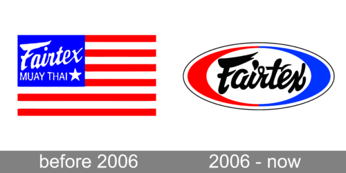
Before 2006
2006 – now
The logo is composed of a wordmark, which can be used on its own when placed on the brand’s products, and in a colorful frame for websites and icons.
The Fairtex nameplate is executed in a custom cursive lettering, where the dot above the letter “I” resembles a drop and the loop of the “R”, located next to it, has a free round space inside, which creates a playful character and adds uniqueness to the logo, making it instantly recognizable.
For the website versions of the visual identity, the brand uses black color for the let-tering and a red, white and blue tricolor for the horizontal oval frame. Two equal parts — red and blue — form one more oval in white, where the inscription is placed. It looks bright and distinct.


