Faberlic is a Russian multi-level marketing company offering cosmetics, clothing, shoes, and accessories. It was established in 1997, while the current name was adopted in 2001.
Meaning and history
The minimalist style of the Faberlic logo makes it easy to incorporate into almost any visual context. That is why it does not look out of place on a variety of products no matter how different their style is.
What is Faberlic?
Fabelic is a Russian company, which appeared in 1997. It specializes in producing of high performance cosmetics for men and women. They’re one the most successful and largest Russian companies in this sphere. They also make a variety of different footwear, clothes as well as accessories.
2001 – 2009

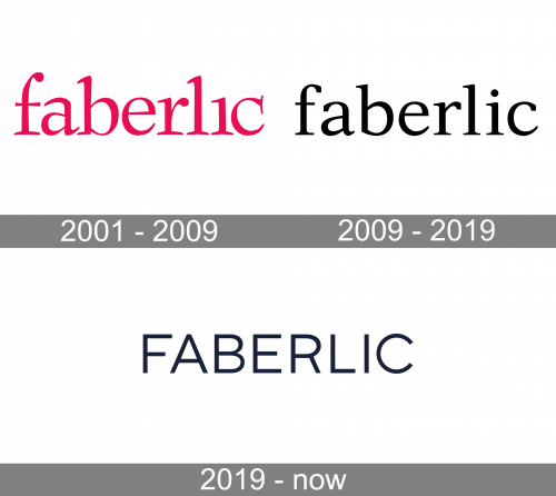
The 2001 wordmark of the brand had a red serif typeface with fewer gaps between lowercase letters. The feature of this wordmark was the look of ‘I’, ‘i’ and ‘b’ characters. They slightly reminded the ‘1’ number.
2009 – 2019

In 2009 they had turned the color of the name to black and added wider gaps between letters. They also added a dot upon ‘i’ letter.
2019 – Today

The 2019 wordmark depicts the brand name written in a sans serif typeface with slim uppercase letters.
Font and color
The 2019 wordmark has a typical sans serif font with uppercase letters. The black colored letters in the name have a slight, slim and thin style, which gives nameplate intensity.


