Clean & Clear is a skincare brand, created by Johnson & Johnson in 1956. The brand’s products are focused on the young skin and feature a range of cleansers and moisturizers. Today the brand is popular all over the world for its good quality and affordable prices and distributes its cosmetics in almost 50 countries across the globe.
Meaning and history
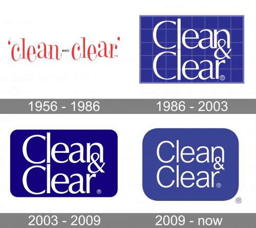
The iconic skincare visual identity history is almost impossible to track in the period from the 1950s to the 1990s. But starting 1991, the brand’s logo always adhered to one style.
The blue rectangle with a white wordmark on it has become synonymous with skin cleansing and acne problem solutions. Throughout the years the blue color gained new shades and the inscription changed its typeface, but the mood and the style of the brand’s visual identity remain the same.
What is Clean & Clear?
Clean & Clear is the name of an American cosmetics brand that is specialized on products for sensitive skin. It is a part of the largest corporation – Johnson & Johnson. The names was founded in 1956 as a separate line within Revlon, offering products to eliminate teenage acne and black spots.
1956 – 1986
The original Clean & Clear logo was created in 1955, and stayed with the brand for thirty years. It was a friendly and playful red lowercase lettering in an elegant serif font with the elongated and curved bars of some letters, and the characters placed “jumping” above the line. The two lowercase words were set on a plain white background and separated by a small black “And” in the uppercase of a modern sans-serif typeface.
1991 – 2003
The Clean & Clear logo from 1991 was composed of a bright blue rectangle with sharp angles and the white inscription in the middle. The background of the emblem resembled a student’s notebook, as had a checkered pattern, formed by thin gray lines. It was a reflection of the brand’s focus on a young audience, as teenagers and people from 20 to 25 yo are the ones to have skin conditions the company’s cosmetics aims to fight with.
The trademark’s wordmark from the 1990s is set in two levels, where each letter is placed under the same of the other word, except for “N” and “R”, that are separated by the ampersand, placed under the “N”.
Font
Both levels of the wordmark are executed in one typeface, which is very similar to a sans-serif Ahoura Light, which is a combination of geometry and calligraphic elements. The font boasts a fine balance between the traditional approach to writing and the strong modern sans-serif aesthetic.
The straight lines of both letters “L” have almost no space between them and create a long vertical, which visually makes the inscription stronger and more confident, while the rounded silhouettes of other letters add a sense of light and create a friendly and welcoming feeling.
2003 – 2009
The redesign of 2003 made the Clean & Clear logo simpler and more distinct. The background is now solid blue, without any additional decoration, and the sharp angles of the rectangular badge became round, which represents the brand as caring and professional in its field.
Font
The font of the 2003 version of skincare’s visual identity looks pretty similar to the previous one, but the letter lines are thicker and look more intense and strong. The typeface still looks similar to Ahoura, but now its Bold variation, and it is also close to Columbia Serial Light, which is a solid and elegant sans-serif font.
2009 – Today
Another redesign of the brand’s visual identity was held in 2009 when the logo version we all know today was created. The blue of the background became calmer and lighter, while the lettering is now in a smaller size and looks more delicate and nice. The brand still uses a rounded rectangle as the base for the emblem, but due to a new size of the wordmark, the shape now more resembles a square and has more free space under and above the nameplate.
Font
The new version of the logo uses a different style of the inscription. Now the “Clean & Clear” lettering is executed in a simple and neat sans-serif typeface, which is similar to Sequel Sans Light font or Arial Nova Light, which both are modern and clean multi-functional fonts.
Due to the new typeface, the inscription looks more professional and evokes a sense of reliability and loyalty of the brand, making the logo friendly and trustworthy.
Review
The Clean & Clear product range includes all types of cleansers possible — gels, foams, liquid soaps, and scrubs, alongside cleansing wipes and stripes for the pores and problematic zones.
The company has a rich experience in providing its customers with the best possible solutions for acne sling and blackheads. There are not only cleaning and eliminating lines in the brand’s portfolio, The trademark also produces moisturizers for different skin types and facial masks, which help to soften and detoxify the skin.
The brand’s website contains information on all the products and has a lot of reviews and tutorials on how to use the skincare items for a better result. The resource is pretty informative and you can read stories of real people, who had different skin issues, which brand’s products helped to minimize.
Color
The branding of C&C has mostly used the color blue since the 80s. The exact shades changed from design to design, but they were predominantly dark, coming close to navy blue. The 2009 logo is also dark, but it uses a paler look – much like the sapphire, rather than navy blue.


