Exo is a musical band, established by SM Entertainment in 2012 and based in South Korea. Their main musical direction combines pop-related genres, while the main theme of their songs, primarily marketed towards girls, is romance. The group is divided into two parts: Exo-K, singing for Korea, and Exo-M, singing for China in Mandarin. Exo became popular in 2013 after the release of their first album, XOXO. In the years to come, Exo recorded 7 studio albums and 4 live albums that drew an attention to the band across the world. The Exo current members are Xiumin, Suho, Lay, Baekhyun, Chen, Chanyeol, D.O., Kai and Sehun.
Meaning and history
Exo derives from a k-pop band project, thought by the CEO of SM Entertainment Lee Soo-man in the second half of 2000s. Initially, it was supposed to be a boy band, split in two divisions singing in Korean and Mandarin respectively. Originally, the band was composed of Suho, Kai, Beekhyun, Chanyeol, Sehun, D.O., Kris, Lay, Xiumin, Tao, and Chen. They split up into two groups responsible for Chinese and Korean auditories. After a few discussions between the members and sponsors, the group was officially established in 2012 under the name ‘Exo’, deriving from the word ‘Exoplanet’.
What is Exo?
Exo is a boy band originating from Seoul. They sing K-pop songs about love and life, primarily promoted across teenage girls auditory. The band’s discography consists of 7 studio albums, 4 live albums, as well as numerous extended plays and singles. The group consists of nine members: Xiumin, Suho, Lay, Baekhyun, Chen, Chanyeol, D.O., Kai and Sehun. They’re grouped into two branches, singing for China and Korea.
2012 – 2013
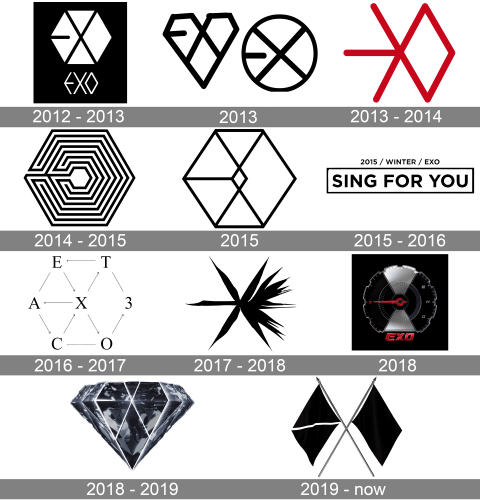
The first logotype was used for the band’s first work called ‘Mama’. It was a white hex image divided in four parts by an ‘X’ symbol. There was also a black line placed in the left rhomb. It didn’t cross the diamond completely, but it occupied 2/3 of its diameter. Below the hex, there was the brand’s name written in all capitalized characters. It had the slim letters reminding geometrical figures. The whole image was put in a black rectangle
2013
The next logotype was made for their first studio album, XOXO. It was a black heart with an ‘x’ symbol incorporated in it. To the right, there was a black circle, which also contained an ‘x’ symbol in it. Both figures had black lines that went from the left border of each shape and then abruptly stopped short of the center.
2013 – 2014
The brand’s following insignia was drawn for the band’s fresh EP called Miracles in December. The mark showed a red rhomb with three lines coming from its left edge. They went in three directions: horizontally and diagonally up and down.
2014 – 2015
The Overdose extended play logotype was composed of a labyrinth, limited in the hexangular shape. The labyrinth’s central area was empty.
2015
The 2015 logotype was used for their studio album called Exodus. It featured the unchanging hex in slim black contours. The hex was divided in four triangles, all placed to the left, and a rhomb to the right. At the very center, there was a smaller rhomb which served as the node for all figures.
2015 – 2016
The next play, Sing for You, had a logotype of a black rectangular frame with the work’s name placed inside it. The inscription had a capitalized sans-serif font. Above the rectangle, we can see another lettering with ‘2015/winter/Exo’ words.
2016 – 2017
The next logo appeared with the group’s third studio album, Ex’Act. It showed Cyrillic letters ‘а’,’т’, ‘x’, ‘e’, ‘o’, ‘c’, ‘з’, spread in the position so they formed a hexagon. Some of them were connected by pointers, so you could easily form the English word ‘exact’. Other pairs of letters, such as ‘a’ and ‘e’, ‘c’ and ‘o’, ‘т’ and ‘з’, just had lines between them. The characters themselves had the typical Times New Roman font.
2017 – 2018
The release of their fourth studio, album, The War, was accompanied by the new logotype. The image was supposed to remind an explosion. It consisted of a black star with six main bold and sharp lines, and two additional lines coming diagonally from the center. The lines were drawn in such a way, so they looked like the symbols of the brand name.
2018
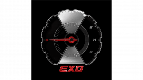
The next logotype was prepared for the band’s 5th album, Don’t Mess up My Tempo. It was a speedometer split into two halves by an ‘X’-like barrier, having a central circle with a speedometer’s needle. It showed at the ‘5’ number, placed in the left sector. On the right side, there were the gray letters of the brand name. Below the speedometer, we can see the red-colored nameplate in a capitalized angular typeface with a metallic style.
2018 – 2019
The following logotype was used on the cover of their sixth album, Love Shot. It represented a diamond with many facets shimmering white, black and blue between each other. The central zones were highlighted, so they formed a hexagon with a lengthened bottom part. Traditionally, in this hex they hid the brand name.
2019 – today
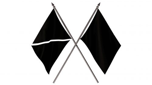
The logotype created for their seventh Obsession album depicted two black flags crossing one another. The gray flagstaffs crossed one another. The left flag had a white line coming diagonally through it. In all this, the brand designers incorporated the letters of the brand name.
Color
Retrospectively, the brand logotypes were drawn in black and white. However, some crests have another coloring. For example, the Miracles in December logotype of 2013 is red. The 2018 speedometer is black, but it has a gradient white and gray ‘X’ symbol at the center. In the right zone, they’ve settled the gray letters, and below they set the red ‘5’ number and nameplate. The diamond logo for the Love Shot album has a gradient black, white & blue coloring.
Font
The brand designers wrote letters in the logotypes only four times throughout the band history. Every time they used a different typeface. In the 2012 sign, we can see the capitalized nameplate made of geometrical figures. The 2015 ‘Sing for You’ album insignia features a semibold sans-serif typeface for both the upper and lower inscriptions. The letters in the 2016 logo have the Times New Roman font. Finally, the 2018 speedometer crest has a heavy script with angular sans-serif letters.


