Evans is a women’s clothing brand focused on plus-size clothing, lingerie, and wide-fitting shoes. The label headquartered in the UK and Ireland belongs to the Arcadia Group.
Meaning and history
Evans is a British brand sewing women’s clothing of large sizes, also under the brand shoes and accessories are produced. Belongs to Arcadia Group as well as Burton, Wallis, Topman, Topshop, Dorothy Perkins, Miss Selfridge.
The brand was founded in 1930 by entrepreneur Jack Green and at first it was just a small store of women clothes.
In 1970, Evans was bought by Arcadia Group, and within the first few years took the leading position on the world market of plus-size clothing.
What is Evans?
Evans is the name of a British fashion brand, which is focused on the production of clothing for plus-size women, along with lingerie and accessories. The company was established in the 1930s, and today is a part of the famous Arcadia Group, which owns several popular fashion labels in the United Kingdom.
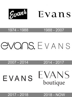
1974 – 1988

The company’s history can be traced back to 1930. In 40 years, it was made public and introduced mail order purchases. The new status required a new visual brand identity. The 1974 Evans logo features the name of the brand in a cursive script. The elegant glyphs have a soft feminine touch, which is beneficial for a women’s clothing label.
1988 – 2007

The brand was already referred to as the market leader in plus-size clothing for women (size 14 and above). The logo went through a complete overhaul. It is more in line with the new understanding of femininity. The glyphs stand apart from each other. They are more “stable.” And yet, they have preserved an elegant touch and individuality. You can notice it in the characteristic serifs, the varying widths of the strokes forming the glyphs, and the gaps in the “E” and “a.”
2007 – 2014

The glyphs are now formed by strokes of the same width. The design looks more minimalist than its predecessor. It celebrates the beauty of the circle shape. The dot hints at the brand’s image as a final destination for those who want to buy women’s plus-size clothing.
2014 – 2017

In contrast to the circle-dominated previous logo, this one is all about straight lines and sharp angles. It is lighter, too.
2017 – 2018

The glyphs have grown bolder without changing their shape.
2018 – Today

The name of the brand in the Evans logo features a beautiful yet seemingly simple typeface. There are no serifs. The shape of the glyphs is pretty utilitarian. And yet, due to the variety in the width of the strokes, the wordmark looks refined.
Font and Color
The visual identity of Evans Boutique consists of two lines of lettering, with the top line featuring an uppercase “Evans” in a sleek sans-serif font, which is pretty close to such types as Resort Sans Light, or Luxerie Regular, and the lowercase serif “Boutique”, written in a typeface, similar to Minion Medium Condensed Caption, or Arabs Hebrew Regular.
As for the color palette of the Evans Boutique’s visual identity, as with almost any other luxury fashion-related brand, the label uses black for the lines of the elements, and plain white for the background. This is a timeless and elegant combination, which adds chic and sophistication to any badge.


