


 European Wax Center Logo PNG
European Wax Center turned waxing into a destination of its own. No crowded salon menu, no attempt to cover every corner of the beauty world. The service stayed specific, the experience repeatable, and the bright square sign became difficult to miss. What began with one Florida center grew into a nationwide network, carrying the same direct promise from city to city: this was the place that knew waxing better than anyone else.
Meaning and history
European Wax Center began in Aventura, Florida, in 2004. Brothers Joshua and David Coba saw room for a business built around one service instead of twenty. Waxing moved out of the back pages of a salon menu and became the main event.
That changed the whole atmosphere around it. Dedicated rooms. Specialists trained for the same work every day. Products developed for the process. Even the visit followed a recognizable pattern. Less improvisation, more confidence.
The name was long, but it did its job without wasting a word. “European” brought a polished beauty association. “Wax” stated the service immediately. “Center” made the place sound focused and established. Nobody had to guess what waited behind the door.
Franchising began a few years later, and the pink square started traveling. It appeared on storefronts, shopping-center signs, appointment cards, product bottles, and digital booking pages. The business changed scale. The logo barely needed to. Three stacked words remained enough for people to recognize the brand.
Still, the old identity carried the habits of another era. It was tall, fixed inside its box, and completely dependent on the full company name. Useful on a large sign. Less comfortable in the corner of a phone screen or over a photograph.
The 2026 transformation loosened everything. The square survived, but the wording disappeared. In its place came a compact monogram with two solid outer letters and a softer form twisting between them. The color moved from salon pink to a stronger red. Photography, interiors, type, and advertising changed around it as well.
The new emblem feels almost physical. The middle character bends like warm wax being pulled into a thin strip, while the shapes beside it stay broad and steady. Smoothness and expertise, reduced to three letters. A neat solution for a company that no longer needed its full name written out every time.
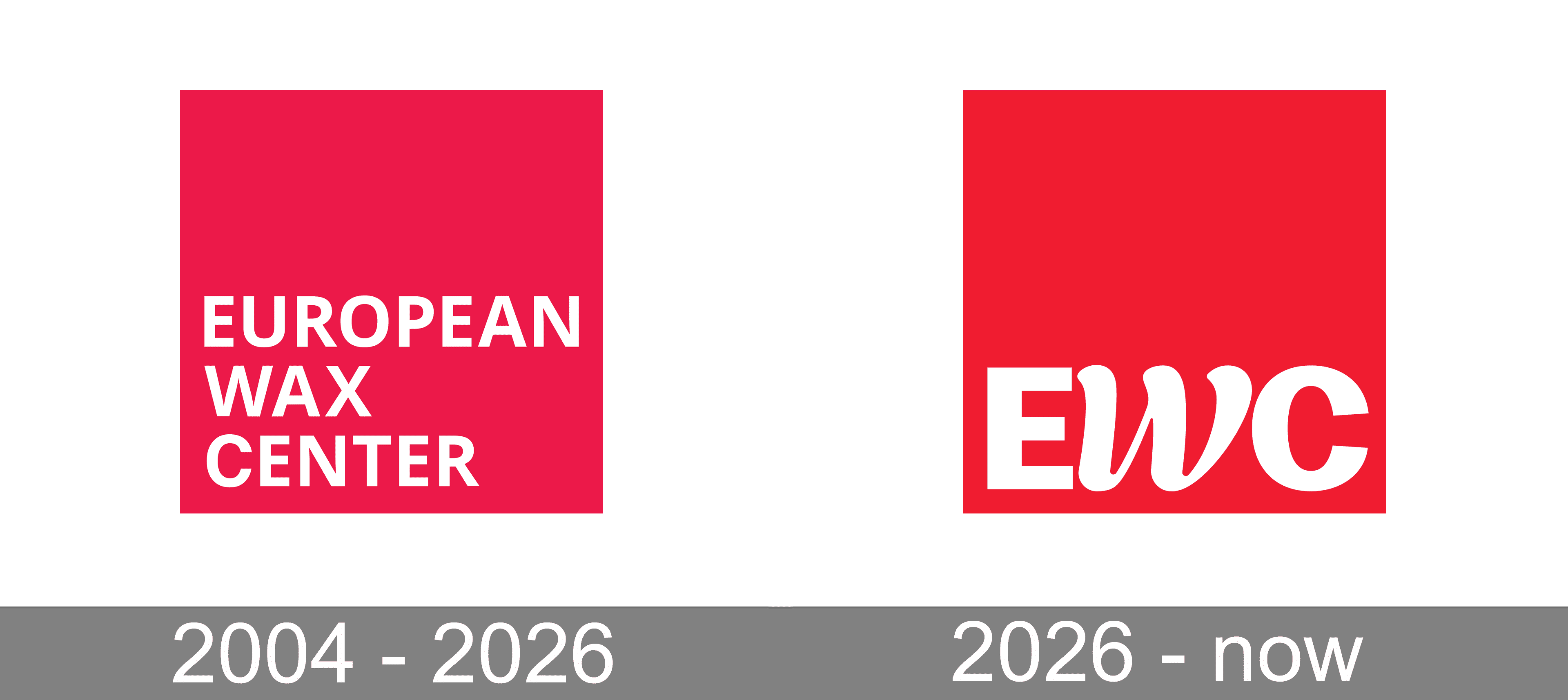
2004 — 2026
The original emblem was a large hot-pink square with the full European Wax Center name tucked into its lower-left corner. Three white words sat one above another in a narrow sans-serif typeface, leaving an unusually generous field of empty color around them. The arrangement was simple, perhaps even blunt, but highly practical. Pink placed the company firmly inside the beauty market, while the stacked inscription turned a long name into a compact sign that could be repeated almost anywhere.
2026 — Today
The redesigned emblem keeps the square but removes the full company name. Three white initials fill most of the red field, creating a much stronger and more compact image. The first and final letters are broad, rounded, and geometric. Between them sits a narrow, flowing character with curved strokes and swollen ends, almost like a ribbon of warm wax pulled into shape. The contrast gives the mark its personality. Solid on the outside, smooth in the middle, and simple enough to work on anything from a storefront to a tiny app icon.
Font and color
The emblem uses custom lettering rather than a single ready-made typeface. The two outer characters are wide and rounded, with heavy strokes and open internal spaces. Between them, the central form becomes thinner and more expressive, curling through the composition like a ribbon of softened wax. The contrast prevents the monogram from looking stiff.
A clear red covers the square, replacing the softer pink of the previous identity. White is used for the lettering and nothing else. The combination is bright, clean, and immediately visible, while the absence of outlines, shadows, and gradients keeps the small emblem sharp across signs, packaging, and screens.


