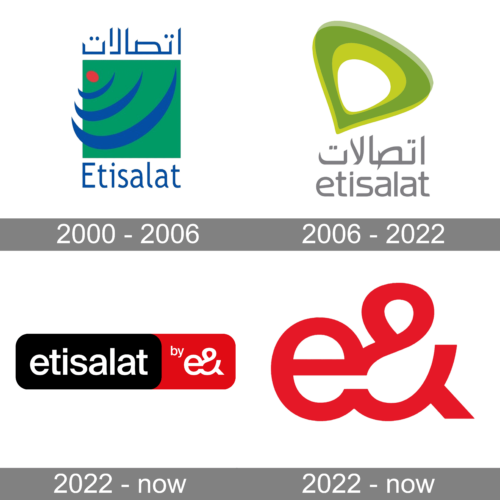
The evolution of the Etisalat logo reflects the shift in how we perceive communications and telecommunications, in particular.
Meaning and history
Etisalat is the trade name of Emirates Telecommunication Group Company PJSC. The Emirati-based telecommunications services provider was founded in 1976. In 2014, it was named the world’s 14th largest mobile network operator.
2000 – 2006
The previous logo looked pretty cluttered and messed, although it was also meaningful.
We can start “deciphering” it from the red dot and three stylized blue curves. The dot symbolizes the source of the signal, while the blue curves represent the signal itself. While this is a great message for a telecommunications company, the dark green square over which the design is placed steals the contrast. Also, this way of representing communication appears slightly old-fashioned.
2006 – Today
The updated logo is supposed to help position Etisalat as the new global player in its industry. It is part of a major restructuring program. According to the company, the emblem reflects the brand’s core values, including transparency, optimism, openness, simplicity, and reliability.
The Etisalat logo is reminiscent of the water drop turned upside down and slightly tilted. Representing communication as a flowing liquid is a more modern approach found in the logos of other telecommunications companies (Telenor, for instance). The combination of the lighter and darker shades adds some depth to the design.
The green color is the national color of the UAE, Etisalat’s home country. Also, it was chosen as the color symbolizing life, growth, and renewal.
2022 – now
The redesign of 2022 has created two badges for Etisalat, executed in a powerful black, red, and white color palette, with clean bold elements. The first version features a horizontally-oriented banner with rounded angles, the left black part has a lowercase “Etisalat” inscription in a modest Sans-serif font, and the smaller red part — the white emblem, composed of the lowercase “E” merged with an ampersand.
2022 – now
Another version of the logo, created for Etisalat in 2022, features just an emblem, with the “E” and the ampersand, set in dark red against a white background, and executed in thick clean lines with straight cuts of the ends.


