Ernst & Young Logo PNG
When Ernst & Young updated its logo in 2013, it got mixed reviews.
Ernst & Young is the name of one of the world’s most reputable audit agencies, which was established in the United Kingdom in 1989 as a result of a merger of two companies, founded at the beginning of the 20th century.
Meaning and history
Ernst & Young, also known as EY, was founded in 1989 in London, England, by merging the American accounting firm A. C. Young, founded by Arthur Young in 1906, and Ernst & Whinney, founded by Alvin Ernst in 1903.
Today Ernst and Young are one of the Big Four audit companies, with aglobal representationin more than 150 countries, and over 200 thousand employees.
The company provides consulting and auditing services in various areas of activity. The services of Ernst & Young include audit, tax, legal, strategic, transactions, and consulting.
What is Ernst & Young?
Ernst & Young is one of the world’s Big Four audit companies, which was established in Great Britain at the end of the 1980s. Today the company operates worldwide, with almost a thousand offices in more than 150 countries across the globe.
1989 – 2013
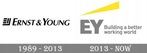
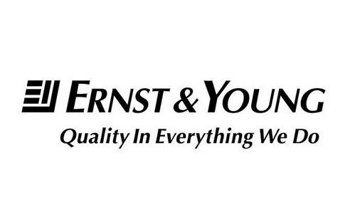
The majority of the surface of the original Ernst & Young logo was occupied by the full name of the company. It featured an italicized sans serif type where the glyphs were made up of the strokes of varying widths. Also, while all the letters were capitalized, the initials were larger than all the other letters.
The writing “Quality in Everything We Do” below also featured an italicized sans but the majority of the letters were lowercase (except the initials).
To the left, there was an emblem representing the interlocked “E” and “Y” (which was not obvious, at first glance, though).
2013 – Today
 The company shortened its name and introduced a new logo. According to EY, the new name is supposed to “provide consistency and ease of use.” This appeared necessary as, before that, the name was shortened both to E&Y and EY in various sources.
The design now features the large, bold letters “EY” paired with the writing “Building a better working world” in gray. There is a yellow triangle above adding a vivid and dynamic touch. The logo is often used without the tagline.
As the company explained in its press release, both the shortened name and updated EY logo “reflect the goal… to be the number one brand in our profession.”
The Business Insider website, however, ranked the new logo second in its list of worst corporate logo changes of 2013. The update “makes it look like some offbeat ad agency or tech startup,” explained Business Insider. The Brand New blog supposed the new design reminded “a trucking company or the parent company of Budget car rental.”
Font
The type on the 2013 Ernst & Young logo looks simpler and a little better legible than on the previous one.
Company overview
Ernst & Young Global Limited is among the best-known professional services firms in the world. It is one of the Big Four accounting firms.
Similar to quite a few accounting firms, it has added other services to its range in recent years, from strategy to HR and financial services consulting.
The number of employees exceeds 270,000. They work in more than 700 offices in 150 countries.


