Yonex is one of the most prominent manufacturers in the badminton, tennis, and golf market, the brand has signed contracts with a large number of top players and provides large-scale financing for professional tournaments. The company was founded in Japan in the 1950s as Yoneyama.
Meaning and history
Yonex is a top manufacturer of badminton equipment. The company, which has been on the market for over 70 years, has been continuously improving the quality of badminton equipment. Yonex products are designed for both professional and amateur players in a wide price range.
In 1946, Japanese entrepreneur Minoru Yoneyama founded the Yoneyama brand. The company’s first products were wooden boats, barrel stoppers, and floats for fishing nets. However, the business did not become successful due to the fact that the world began to use plastic and cheapened the market. And in 1957 it was decided to refocus on the production of badminton rackets. And already in 1967, Yonex introduced the world to the aluminum racket T7000.
1974 The name of the company is changed to Yonex. The word is more concise and pleasant to hear. Four years later, the ultra-light Carbonex 8 racquet for badminton was launched. A tennis racket under the Yonex logo, the R-7, is the first in the world to win Wimbledon and the French Open.
In the 1980s Yonex gained popularity among professional tennis players due to the unusual shape of the racket head and large center spot, which allowed them to control the ball and strengthen the game. In 1990, Monica Seles became the youngest tennis player to play with a Yonex racquet.
In 1996 Monica Seles, playing Yonex SRQ-500 Long, set an undefeated world record at the Australian Open. A year later, another Yonex mentee, Martina Hingis, takes the No. 1 prize. In the future, contracts with the world’s top players and Yonex multiply with inexorable speed.
Currently, 80% of players use their products. The blue-green “YY” logo, created in 1973, is seen on almost every court in the world. Yonex subsidiaries are located in the USA, UK, Canada, Germany and Taiwan.
The brand does not stand still and every day is looking for new technologies and forms to improve the goods. Nigata Factory production is located in the city where the founder of the brand was born and keeps its traditions. The final inspection of each racket is always left to the individual. Before the rackets go on sale, they go through 50 stages of testing.
What is Yonex?
Yonex is the name of a Japanese sports brand specializing in the production of shoes, clothing, and, most importantly, equipment for tennis, badminton, and golf. According to statistics, more than 80% of the world’s badminton players play with Yonex rackets.
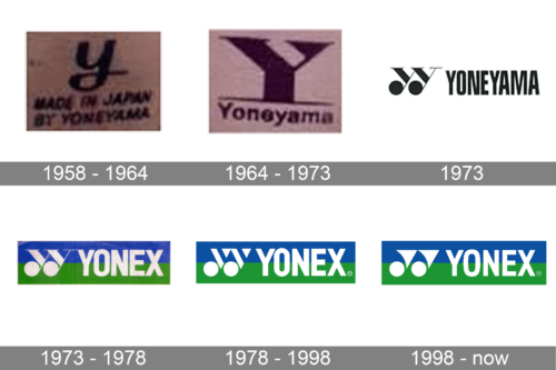
In terms of visual identity, the Yonex logo history can be split into two periods — the Yoneyama one, and the Yonex, which started in 1973. However, it’s worth mentioning that the iconic Yonex emblem we all know today was derived from the last badge of Yoneyama.
1958 – 1964
The original Yoneyama logo featured a simple composition with the bold lowercase “Y” in cursive accompanied by the two leveled “Made in Japan by Yoneyama” inscritos in the uppercase of a handwritten sans-serif typeface with the slightly slanted characters.
1964 – 1973
The redesign of 1964 has been introduced somewhat sharp and progressive. The cloth cursive “Y” from the 1960s was replaced by a massive geometric capital with triangular elements. As for the tagline, it was now separated from the emblem by a thin blue line and featured only “Yoneyama” in the title case of a traditional sans-serif typeface.
1973
The last Yoneyama logo was created in 1973 and only stayed active for several months. It was the predecessor of the current Yonex badge. The logo, set in a black-and-white color palette was composed of uppercase lettering in a bold narrowed sans-serif and a wide emblem with two stylized letters “Y”. The letters featured solid rounded at the end of their tails and sharp long serifs on the tops.
1973 – 1978
After the renaming of the brand to Yonex, the logo was changed again. The emblem remained the same — two stylized letters “Y”, but now they were drawn in white, on the left from the white sans-serif wordmark, on a background, horizontally separated into blue and green halves. Even though the style of the emblem was changed several more times, the color palette remained the same up to date.
1978 – 1998
The redesign of 1978 has played with the Yonex emblem, keeping the wordmark and the color palette untouched. The elegantly stylized “Y”s were replaced by modern geometric figures. Now it was two solid white circles at the bottom, accompanied by two triangles pointing down and “cut” by thick blue lines, parallel to the left edges of the figures. In a new style, the emblem started looking more like a badminton shuttle.
1998 – Today
In 1998 the Yonex emblem was redesigned again, giving more elegance to the shapes of the stylized “Y”s. The triangles became solid and got their left edges slightly arched to the center, with the peaks playfully curved to the left. This emblem is an abstract depiction of a badminton racket and a shuttle.
Font and color
The bold and stable lettering from the primary Yonex logo is set in the uppercase of a distinctive geometric sans-serif typeface, which is very close to such famous font as Swiss 722 STD Bold Condensed. It evokes a sense of professionalism, excellence, and confidence.
As for the color palette of the Yonex visual identity, since the beginning of the 1970s, it has been based on the combination of blue, green, and white, the fresh and eye-catching scheme, which perfectly represents the energy of the company and its striving for innovation.


