 Enterprise Rent-A-Car Logo PNG
Enterprise Rent-A-Car is a car rental company based in Clayton, Missouri. In addition to car and truck rentals, it also offers car sharing and car sales. There’re over 8,000 locations worldwide, according to the brand’s official website. The brand’s roots can be traced back to 1957. It was established in St. Louis, Missouri by Jack C. Taylor and was initially called Executive Leasing Company.
Meaning and history
The Enterprise logo has changed its look dramatically more than once. Hardly a surprise, taking into consideration that the company has a more than 60-year history.
What is Enterprise Rent-A-Car?
Enterprise Rent-A-Car is an American company, which was established at the end of the 1950s, and today operates all over the globe through more than 8 thousand offices, offering car rental and sale services to the population.
1957 – 19?? – Executive Leasing Company
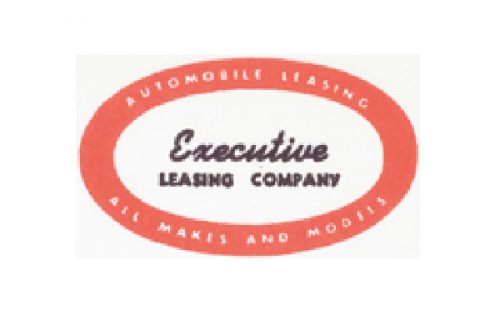
The original logo was as vague as the name. Its only recognizable element was a pink ellipse with white filling. Inside, there was the word “Executive” in a cursive type, which was placed over the white background. Also, the lettering “Leasing Company” in a simpler sans could be seen below.
As the name of the company barely said anything about the services it provided, there was a need for an explanatory text. It was placed inside the pink elliptical border and read: “Automobile Leasing. All Makes and Models”.
The text was excessive and tiny, which didn’t enhance legibility. Yet, at least, if you took a closer look, you could understand what the company offers.
19?? – 1969
This logo was a major step forward.
Firstly, there is a sleek and meaningful emblem. It features the letter “e” formed by a stylized highway. This immediately links the emblem to the services the company provides.
The lettering “Executive Leasing” in a clean typeface comes below the emblem. It is by far larger and better legible than in the previous version.
What is Enterprise Rent-A-Car
Enterprise is a car rental network. It’s the best-known brand of Enterprise Holdings, whose portfolio also includes other agencies, for instance, Alamo Rent a Car and National Car Rental.
The Enterprise logo dropped the explanatory text and the word “company.” On the one hand, this resulted in a simpler design. On the other hand, despite the “highway” “E”, the “car rent” message wasn’t very straightforward.
19?? – 1969 – Executive Rent-A-Car
In an attempt to make the brand identity more meaningful, the company adopted the new name “Executive Rent-A-Car”. This gave potential customers an immediate understanding of the services they could get here. As a result, the logo became straightforward enough, too – the lettering “Rent-A-Car” made it perfectly clear.
However, the authors of the logo decided to also change the palette replacing the green field with a brighter and optimistic yellow one.
1969 – 1971 – Enterprise Leasing
The name “Enterprise” was chosen by Tailor as a reminder of the aircraft carrier USS Enterprise, on which he served during World War II. The “drop-a-car” name was again replaced by “leasing”, and the yellow was replaced by green once again.
1971 – 1995 – Enterprise Rent-A-Car
Having adopted the current name, the company got rid of the color on its logo. The “E” went black-and-white. As if to make matters worse, a more static typeface with right angles was adopted.
1995 – 2007
The “E” went green again, while the lettering “rent-a-car” grew smaller in the Enterprise Rent-A-Car logo.
2007 – present
Today, the primary version only features the word “Enterprise,” but there are also versions including the lettering “rent-a-car” and, sometimes, the slogan “We’ll pick you up.”
Colors and font
The Enterprise logo has been loyal to green for much of its history. The type has undergone several updates. The current one is legible enough, but you may feel there’s a need for a more dynamic font to fit the “highway” “E”.


