Eni Plenitude, operating under the Italian energy giant Eni S.p.A., specializes in the sale and marketing of gas, electricity, and the management of electric vehicle charging points. Launched as Eni gas e luce in 2017 and rebranded in March 2022, it’s steered by CEO Stefano Goberti. Its operations span Italy’s major cities and extend to France, Greece, and Slovenia, boasting nearly 150 franchised stores and a large customer base.
Meaning and history
Eni Plenitude, formerly known as Eni gas e luce, is a subsidiary fully integrated within the Italian energy titan Eni S.p.A. The story of Eni Plenitude is a tale of strategic transformation and a testament to Eni’s vision for a sustainable future. The company originated as the Gas&Power division of Eni and transitioned into a standalone entity dedicated to retail gas and electricity on July 1, 2017. With Stefano Goberti at the helm since November 2021, Plenitude has expanded its focus beyond the distribution of energy to the production of renewable sources and the development of electric vehicle charging infrastructure.
In November 2021, during the Capital Markets Day event at the Milan Stock Exchange, Eni repositioned the company to fuse renewable energy production with energy sales and services, including a network for electric vehicle charging. This rebranding and strategic realignment culminated in March 2022 when Eni gas e luce was officially renamed Eni Plenitude. The company’s operations now extend throughout Italy and into France, Greece, and Slovenia, reflecting its growing international footprint. Plenitude serves a robust clientele, which is part of its mission to deliver sustainable energy solutions globally.
Eni Plenitude’s evolution is not just in its name but in its operational ethos. The company has become synonymous with sustainable energy and innovative consumer-focused services, managing a vast network of nearly 150 franchised stores across Italy and serving over 10 million customers. Additionally, Eni Plenitude has embarked on several projects for renewable energy generation in key markets, including Italy, France, Spain, and beyond, showcasing its commitment to an eco-friendly future. This journey from a traditional energy division to a modern, sustainable energy company encapsulates Eni Plenitude’s dedication to advancing energy solutions in alignment with global environmental goals.
2009 – 2016
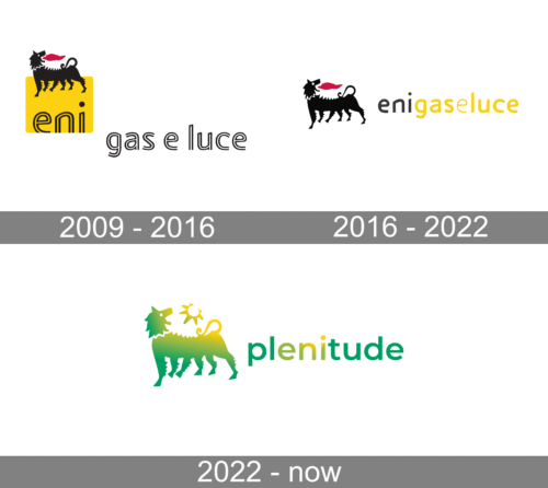
The emblem juxtaposes iconic imagery with modern design, capturing the essence of Eni’s gas and electricity division. The Eni dog, a legendary figure with six legs, stands proudly atop a sunlit yellow field, symbolizing a bridge between the company’s storied past and its luminous future in the energy sector. The creature’s stark black form and crimson tongue hint at a fusion of traditional power with a zest for innovation. Beneath this potent symbol, the division’s focus is crisply spelled out in a sleek, rounded typeface: ‘eni gas e luce,’ underscoring the business’s core expertise in energy provision. This logo encapsulates a heritage-rich narrative while signaling a commitment to energy’s evolving landscape.
2016 – 2022
This logo is a visual narrative of Eni’s energy division, enigaseluce. The historic six-legged dog, an enduring symbol of Eni, is presented in silhouette with a vivacious red tongue, embodying a legacy of robustness and adaptability in the energy industry. The brand’s moniker unfurls alongside in a luminous yellow, its letters crafted in a sleek, sans-serif typeface that evokes modernity and vibrancy. This color choice is emblematic of light and energy, mirroring the company’s expertise in gas and electricity. Together, the elements of the logo convey a message of tradition meshed with innovation—a company rooted in history yet moving brightly forward into the future of energy.
2022 – Today
The logo for Plenitude is a striking emblem that blends ecological and mythical symbolism. Dominated by a spectrum of greens that segue from a deep forest hue into a vibrant lime, the logo features a composite creature with the mane of a lion and the body of a lamb, alluding to a harmony between power and sustainability. Adorning the mythical creature are icons of the sun and a decorative swirl, perhaps signifying energy in its various forms—solar and dynamic. The brand name ‘plenitude’ is rendered in a modern, lowercase typeface that conveys a sense of approachability and freshness. This logo encapsulates the ethos of Plenitude, suggesting a commitment to renewable energy and the balance of nature with progress.


