Energizer is an legendary American brand, which specializes in manufacturing of batteries. It was established in 1980 and today the company is one of the leaders of its industry.
Meaning and history

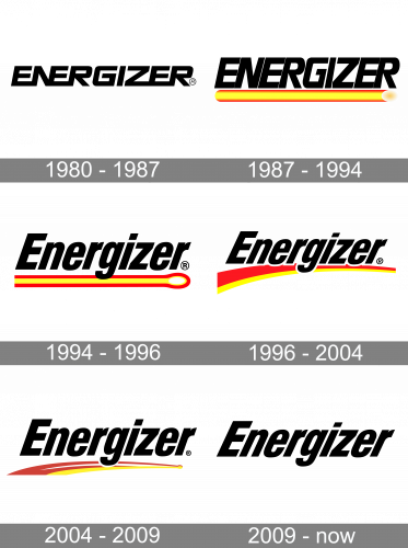
The Energizer visual identity is a representation of masculine energy and strength, along with progressiveness and movement. Its monochrome logotype was changed throughout the years, but the powerful character remained the same. There were several versions with additional bright details created for the brand, and we still can see them on the product’s packaging, but the lettering is what reflects the Energizer character and purpose.
1980 – 1987

The original logo for energizer was introduced in 1980 and featured a black geometric inscription with solid letters. The inscription was visually divided into three parts — the first, “ENER”, where all letters were connected, and “N” shared its right bar with “E”, “GI” with a little space in between, and “ZER”, also connected, but on the bottom. The wordmark was slightly italicized, which made the square letters look dynamic and powerful.
1987 – 1994

In 1987 the logotype was drawn in white and set inside a black rectangle, gaining a bold yellow underline with a sparkling end. It was a representation of the energy the brand’s products give to the customers.
1994 – 1996

Another version of the visual identity was introduced in the same year. It was a black logotype, underlined with a yellow stripe in a red outline. The line got its right end thickened and rounded and featured a lighter shade of yellow, almost white.
1996 – 2004

The straight underline turned into an arched double line in 1996. Executed in red and yellow, it started under the beginning of the wordmark and became thinner to its end. On the overlapping spots, the black inscription gained a delicate white outline. There was also a version with a white logotype placed on a black background.
2004 – 2009

The Energizer logo, introduced in 2004 was bright and minimalist. It stayed with the brand for five yea
Es and was a pretty good and well-balanced representation of world-famous batteries. The letter of the wordmark became a bit taller and thicker, while the double underline — shorter and smoother, and this gave a more contemporary and progressive look to the brand’s visual identity.
2009 – Today

In 1993 the logo we all know today was created. An italicized wordmark in the title case is written in a bold yet simple sans-serif typeface, with slightly narrowed contours and letters placed close to each other. This logotype was in use for three years and then came back as a primary one in 2009.


