Ellesse is a British sport apparel brand. It has Italian origins but has belonged to the British Pentland Group since 1987.
Meaning and history
The Italian brand Ellesse began by creating innovative ski equipment that broke the boundaries between sports and fashion. Leonardo Servadio, the company’s founder, climbed to the top of snow-covered mountains and then successfully descended the tennis court. Today the famous brand is chosen not only by athletes but also by those who love comfortable and stylish clothes.
The name of the Italian brand is made up of the name and initials of the founder Leonardo Servadio. Until the mid-60s, the brand was simply L & S – “Elle” and “esse”. Only 10 years later came to the “Semi palla” mark we know. It combines the cross-section of a tennis ball with tips similar to a pair of skis, symbolizing the brand’s heritage in both sports. Ellesse began placing their logo on the outside of their clothing. They are believed to have been one of the first to do so. That’s when the two letters merged into one full-fledged word, Ellesse.
What is Ellesse?
Ellesse is a famous Italian brand of sportswear, which was established in the 1950s, and has been acquired by the British Pentland Group in 1987. The company is mainly known for its equipment for tennis and skiing.
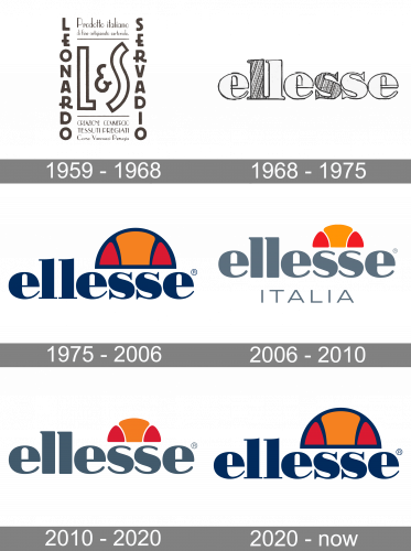
1959 – 1968
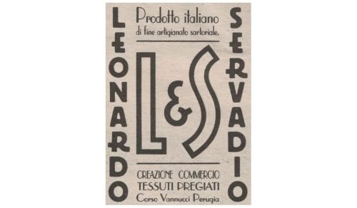
The brand was established by Leonardo “Mantis” Servadio in Umbria, Italy. The name “Ellesse” comes from the founder’s initials, “L” and “S.”
The original Ellesse logo combined the founder’s initials. The emblem looked pretty clean and had a retro touch. Over time, the name of the founder disappeared from either side leaving only the writing “elle” and “esse.”
1968 – 1975
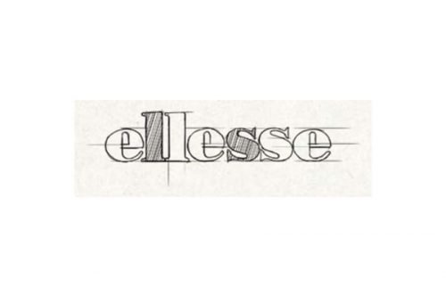
The redesign was carried out to make the logo easier to reproduce on the garments. This version featured the word “Ellesse” in an elegant sans where the width of the strokes varied greatly. In the earlier version, the word was mostly gray, while the founder’s initials, “l” and “s,” were highlighted with the red color. You could also come across versions where all the letters were of the same color or where the writing was italicized.
1975 – 2006
This is when the iconic “semi-palla” logo was introduced. The word “semi-palla” means “half-ball.” The design featured a stylized section of a tennis ball and the tips of a pair of skis. The emblem represented the combination of the brand’s iconic sports: originally, Ellesse was a ski brand, while products for tennis players were added in the 1970s.
The design is still used for the Heritage collections.
2006 – 2010
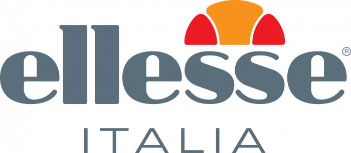
The dark blue lettering got light gray in 2006. The blue contouring of the bright emblem was removed, and the three Ellesse petals were now placed on a white background. Another new thing about the refreshed logo was the thin uppercase “Italia” tagline executed in a lightweight sans-serif typeface with thin straight lines and lots of space between the symbols. The new logo looked airy and cool, while the calm color palette evoked a sense of professionalism and confidence.
2010 – 2020
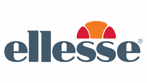
The design grew somewhat cleaner because the blue trim was removed from the “semi-palla.” The dark blue color of the wordmark was replaced by gray. The type was slightly updated, too.
The Elesse logo currently seen on the official website is more like the heritage version with the dark blue trim and writing.
2020 – Today
The redesign of 2020 has intensified the color palette of the Ellesse visual identity and strengthened the contours of both the lettering and graphical parts of the badge. The gray sans-serif inscription turned into a dark-blue in an elegant and sharp serif font, while the white lines between the fragments of the emblem became blue too, and got accompanied by a complete blue outline of the “Semi Palla”. In terms of size, the emblem got bigger and now is covering the logotype from the middle of one “E” up to the middle of the last one.
Font and color
The bold lowercase lettering from the official Ellesse logo is set in a modern and strong serif typeface, which looks pretty similar to such fonts as Bodoni Std Bold and Normandia Regular.
As for the color palette of the Ellesse visual identity, it is set in blue, red, and orange, a bright and intense color combination, which evokes a sense of energy and dynamics. Blue here stands for professionalism, while orange and red symbolize passion and motion.


