

![]() Eggo Logo PNG
Eggo Logo PNG
Eggo waffles were invented in San Jose, California by Frank Dorsa, who developed a process by which waffles could be cooked and frozen so that the consumers could warm them and eat them any time. In 1953, Dorsa, along with his younger brothers Anthony and Sam, introduced frozen Eggo waffles to supermarkets throughout the United States.
Meaning and history
![]()
Of course, Kellogg’s Eggo frozen waffles have always been very popular, especially among Americans. First introduced in the mid-1950s, the waffles quickly gained the trust of customers and became sold in almost every American supermarket.
But the brand got its second breath in the 2020s, after the release of the acclaimed TV series The Stranger Things. Interestingly, Eggo’s ads on the show were not paid for. But Eggo and Netflix actively tagged each other on social media. This significantly increased consumer interest.
American breakfast cereal manufacturer Kellogg’s and owner of Eggo decided to continue its advertising campaign and shared waffle recipes on social media. And sales of Eggo frozen waffles after the release of The Stranger Things series grew 14% from 2016 to 2017.
What is Eggo?
Eggo is the name of a frozen waffles brand, owned by the famous Kellogg’s company. The brand was introduced in the United States in 1953 but is still incredibly popular not only in the USA but all over the globe.
In terms of visual identity, Eggo is quite a consistent brand, and only its first logo, introduced in 1955, was significantly different from all the following emblems. Also, the company has always used red as the main color accent of the composition.
1955 – 1965
![]()
The original Eggo logo was created in 1955 and stayed with the brand for the first ten years of its history. It was a voluminous geometric lettering in blue, with a wide blue shadow and a thin white outline, placed against a plain yellow background with a stylized image of an egg, from white the wordmark was coming out, leaving sharp blue cracks. This was quite a cool graphical representation of the brand’s name.
1965 – 1970
![]()
The redesign of 1965 simplified the Eggo logo and introduced a completely different concept. It was a simple yet memorable red handwritten lettering set on a plain white background with no decorations. The rounded contours of the script characters had a link to the “egg nature” of the brand.
1970 – 1979
![]()
In 1970 the Eggo logo was modernized again. The lettering gained a brighter shade of red and a more elegant slanted typeface with narrower characters. The lines of the letters got bolder and more distinctive, which made the inscription more progressive and stylish.
1979 – 1997
![]()
The redesign of 1979 has emboldened the lines of the Eggo wordmark, closed the open contours of both “G”s, and darkened up the shade of red. Now the badge looked super stable and strong, representing the confidence of the brand on the market and the high quality of the product, hiding inside the package.
1997 – 2006
![]()
In 1997 the bold Eggo wordmark was rewritten in a brighter shade of red and placed on a yellow background with white rays coming out of the letters. The inscription was placed slightly diagonally, which made the badge look even more playful and energetic. The iconic Kellogg’s insignia was added to the composition — in small characters above the second “G” of the main wordmark.
2006 – Today
![]()
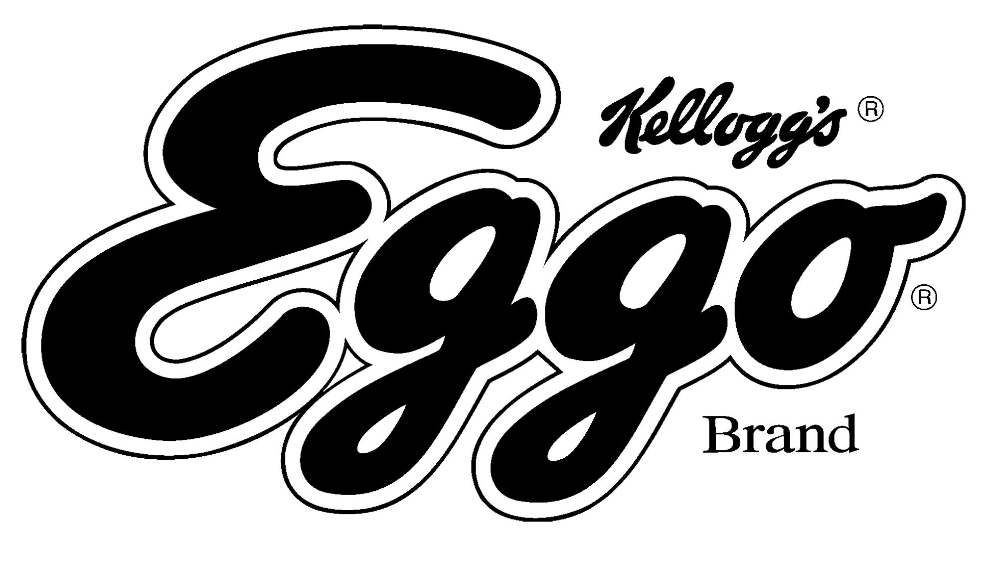
The redesign of 2006 has simplified the Eggo logo removing the bright background from the composition. The Kellogg’s emblem had all the small graphical additions removed and is now executed in its corporate shade of red, which is calmer and darker than the Eggo one. The main wordmark gained a double red and white outline, which makes the image voluminous.
Font and color
The bold cursive lettering from the famous Eggo logo is set in a custom-rounded typeface, which is the same font as the one on the corporate Kellogg’s insignia. Their typeface has somewhat in common with such commercial options as Barley Script, Ballpark Weiner, and Mastoc.
As for the color palette of the Eggo visual identity, is it based on a deep shade of red, which transmits warmth and love, and promises a customer a very cozy and sweet meal.


