Edy’s, a celebrated purveyor of frozen desserts, presently focuses on offering a diverse array of creamy delights. While its core remains ice cream, Edy’s continually innovates to meet evolving consumer tastes. Its key market is North America, where it has cemented its presence in numerous retail outlets. Edy’s operates as a part of the expansive Nestlé portfolio, a global powerhouse in the food and drink sector. This partnership not only underscores Edy’s commitment to superior quality but also leverages Nestlé’s extensive distribution prowess. Today, Edy’s seamlessly blends tradition with modern market dynamics.
Meaning and history
The tale of Edy’s begins in the vibrant 1920s. It’s a story of two visionaries, Joseph Edy and William Dreyer, who pooled their talents in Oakland, California. Edy, with his candy-making expertise, and Dreyer, a savvy ice cream maker, started creating sweet innovations, the most iconic being the rocky road flavor.
The brand was originally christened “Edy’s Grand Ice Cream” to reflect the superior quality. Success was immediate, with the unique flavors and textures striking a chord with the locals.
By the 1940s, despite their achievements, the founders decided to part ways. Both pursued their individual ventures, but it was Dreyer’s legacy that would notably continue the Edy’s name. As the brand grew in prominence, it expanded its production facilities and distribution channels.
A major turning point was the 1980s when the brand was rebranded as “Dreyer’s Grand Ice Cream” in the Western U.S., while retaining the “Edy’s” brand for the East. This two-brand strategy was designed to capitalize on both founders’ legacies without confusing loyal consumers.
The 1990s were transformative. The brand caught the eye of Nestlé, a global food giant. Recognizing its potential, Nestlé acquired Edy’s in 2002, integrating it into its vast portfolio of food and beverage brands.
Under Nestlé’s aegis, Edy’s underwent both infrastructural and branding expansions. This was the era where Edy’s solidified its presence across major American markets. Their production methods evolved, but the commitment to taste and quality remained unwavering.
Innovation continued to be a hallmark. Edy’s began experimenting with lighter, slow-churned varieties to cater to the health-conscious segment. By using a unique churning process, they managed to reduce fat content without compromising the creamy texture.
Additionally, Edy’s embraced sustainability under Nestlé’s global initiatives. From sourcing to production, emphasis was laid on reducing environmental footprints and ensuring ethical practices.
The 21st century saw Edy’s leveraging technology for consumer engagement. Digital campaigns, collaborations with influencers, and flavor-voting contests became commonplace, ensuring the brand remained relevant to the younger audience.
From its inception in the bustling streets of 1920s Oakland to its current global recognition, Edy’s journey is a testament to the power of innovation, collaboration, and adaptation. Owned by Nestlé, Edy’s today stands as a beacon in the frozen dessert industry, retaining its founders’ ethos while continually reimagining its offerings for the modern consumer.
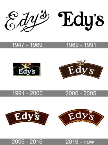
1947 – 1969
The image presents a striking monochromatic representation of the brand name “Edy’s”. Elegantly scripted in a fluid black calligraphy against a pristine white backdrop, each letter in the name seems to dance with vitality. The initial capital ‘E’ unfurls with flair, showcasing intricate swirls and loops that echo the ebullient nature of a ribbon in the wind. The midsection of the logo gracefully transitions to a more streamlined script for the ‘d’, ‘y’, and the apostrophe. The culmination is the vibrant ‘s’, which possesses an artistic flourish as it dramatically sweeps downwards, cradling a stylized figure within its embrace. This figure, abstract and dynamic, exudes an essence of jubilance, perhaps hinting at the joy associated with the brand.
1969 – 1991
The image showcases the logo “Edy’s” in a bold and minimalist design. Rendered in black against a stark white background, the brand name emanates simplicity and sophistication. The initial ‘E’ is depicted with a distinguished upward curl, evoking a sense of tradition. The entire ensemble exudes a blend of classic charm and modern finesse, suggesting a brand that values both its heritage and current relevance.
1991 – 2000
The image showcases a compact logo for “Edy’s,” which is nestled within a dark-hued rectangular backdrop. Atop this canvas, the brand’s name “Edy’s” is etched in bold, luminous letters, offering a brilliant contrast against the deep background. Hovering just above the brand’s name is a gleeful character, seemingly in mid-leap, exuberantly cradling what appears to be an ice cream cone. This spirited figure imbues the logo with a sense of joy and excitement. The overall emblem, although concise in its presentation, manages to convey a blend of classic branding with a hint of playful charm. The logo’s simplicity and elegance are complemented by the vibrant depiction of the ice cream-loving character, blending tradition and whimsy.
2000 – 2005
The image presents the “Edy’s” logo within an elongated, dark chocolate-hued banner. Its framework gives the aura of a vintage marquee or a heritage signboard, reminiscent of early 20th-century storefronts. Dominating the center, the brand’s name “Edy’s” is depicted in bold, pristine white letters. These characters are emphasized by the rich contrast between their luminescent white and the deep brown of the backdrop. Over the left corner, a jovial figure appears to be dashing, playfully holding an ice cream cone aloft. This whimsical character adds a touch of delight and hints at the brand’s association with frozen treats. The logo is tastefully punctuated with an elegant swirl under the letter ‘y’ and a registered trademark symbol beside the letter ‘S’, emphasizing both the brand’s unique identity and its established status in the market. The overall design intertwines a sense of history, quality, and joy, encapsulating the brand’s essence in a visually appealing manner.
2005 – 2016
The logo prominently displays the brand name “Edy’s” in a sophisticated cream-toned cursive script, set against a deep mocha-hued, arch-like backdrop. The capital letter “E” takes a commanding presence, inviting the viewer’s eyes to meander through the subsequent fluidly written letters. Poised directly above the concluding “s” is a petite figure, resembling a runner. This nimble individual, reminiscent of a torchbearer, holds aloft not a flame but an ice cream cone, symbolizing both motion and indulgence. This playful juxtaposition suggests a harmonious blend of activity and sweet rewards. Overall, the design encapsulates tradition with a hint of whimsical modernity.
2016 – Today
The emblem displays the word “Edy’s” in a graceful, ivory-toned script font, set against a rich cocoa-hued, arching backdrop that gives a nod to a delectable chocolate setting. The initial letter “E” stands out with a pronounced size, leading the viewer’s eye through the brand’s name. Right above the tail end of the word, there’s a dainty depiction of an ice cream cone, crowned with a single, melting scoop. Additionally, nestled below the brand’s name is the phrase “Scooping Since 1928,” signifying the brand’s long-standing history in the ice cream business. The overall design marries vintage charm with a sense of creamy indulgence.


