Edward D. Jones & Co. is an American financial services firm based in St. Louis, Missouri. The company boasts over fourteen thousand locations. The Edward Jones logo is an example of a rare loyalty to the company’s heritage.
Meaning and history
Edward D. Jones Sr. started his investment firm in 1922 with a single-room office in downtown St. Louis.
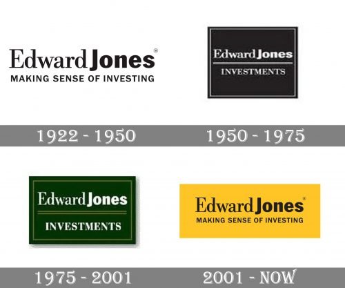
1922 – 1950
The original logo looks the same as the current one.
The entrepreneur opted for a combination of three typefaces. The word “Edward” features a traditional serif font with classic proportions. The word “Jones” is bold and showcases a simpler sans serif. Both the bold weight and the lack of serifs make the second name more eye-catching and better legible. This looks like a pretty wise approach as this word is the most important one in terms of the brand’s recognizability.
Below the name, there is the tagline “Making Sense of Investing.” Unlike the lettering above, where only the initials are capitalized, this one is set in an all-caps typeface. The type is an austere and highly legible sans.
You can come across two versions: black on the white background and black inside a yellow rectangle.
1950 – 1975
The brand’s visual identity was now only given in the solemn black-and-white color scheme. The lettering “Edward Jones” preserved both the combination of the typefaces and the weight.
The tagline was reduced to “Investments” and separated from the writing above by a thin horizontal line. This time, the tagline was set in an all-cap type with serifs.
The text in white was housed inside a black square with white and black trim.
1975 – 2001
The designers made the logo slightly more unique and refined. They introduced a muted palette combining dark and light green. Also, they made the lettering “Investments” more prominent by making it bolder.
The border going along the sides of the box and the thin lines separating the name from the word “Investment” now were equal in their width. Due to this, the design started to look more professional.
2001 – Today
Eventually, the company returned to its original emblem. It was possible partly due to the simplicity and effectiveness of their earliest wordmark. Although it was introduced around a century ago, the Edward Jones logo still looks modern because there’re no additional decorative details.


