The Edeka Group is a supermarket corporation headquartered in Hamburg, Germany. It joins several cooperatives of independent supermarkets.
Meaning and history
The company was established in 1898 as E.d.K. (the full name could be translated from German as “Purchasing Cooperative of Colonial Goods Retailers in the Hallesches Tor district of Berlin”). In 1911, it adopted its current name, which was a phonetic expansion of the original abbreviation.
1911
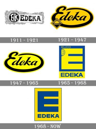
The first Edeka logo combined the original abbreviation and the new full name. The design reflected its era: it was rather intricate, with plenty of elaborate decorative details.
1921
The emblem grew much cleaner and laconic.
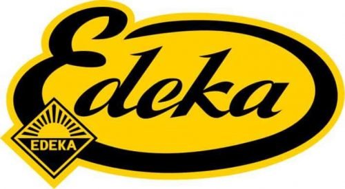
The abbreviation was gone (it was unnecessary now). The angular block letters were replaced by rounded cursive handwriting. The initial, the “E,” had an extended end, which stretched below the other letters, then turned up and to the left forming an elegant ellipse.
The designers used the gold color adding some more individuality to the emblem.
Also, a small emblem appeared in the lower-left corner. There was the stylized sun with the name of the brand in an all-cap sans serif type.
1947
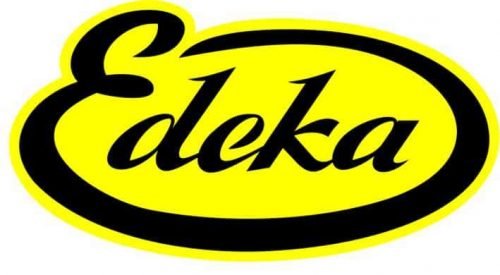
The logo became cleaner due to the disappearance of the emblem in the lower-left corner. This simple step drew the attention to the wordmark itself making it better-legible.
Also, the tint of yellow grew lighter and brighter. While it did not look as refined as its predecessor, it was more cheerful, youthful, and eye-catching.
1965
A totally new design focusing on a large rectangular “E” was adopted. There was the full name below, also featuring a plain all-caps sans. The “E” seemed to have been inspired by supermarket shelves, which was appropriate for the brand.
1968
The Edeka lost the “EUCO” stamp in its top-left corner. The colors were inverted, while the type grew slightly bolder.


