Dyadya Vanya was a Russian counterpart of McDonald’s, planned for launch in 2022. It was registered by Russkoe Pole – Logistics. It was supposed to become the same restaurant chain as McDonald’s, but operated by the local Russian management without any interfering from the Western investors and businessmen. The menu was expected to be the same as in the original restaurant, but (maybe) with the addition of local cuisine. Perspectively, Dyadya Vanya fast-food restaurants were to take over the buildings of all former 850 restaurants of McDonald’s, which now ceased all its operations in Russia.
Meaning and history
In 2022, Most of the European and American companies have left the Russian market or were forced out of Russian business environment for varying reasons. With this agenda, the local entrepreneurs started to register new trademarks, often similar to the Western ones. Dyadya Vanya brand came out of this business and social environment in March 2022. This name translates as ‘Uncle Vanya’ and derives from an Anton Chekhov’s eponymous playwright, released in 1898. However, this trademark was later recalled for some reason. Its place was taken by its more successful ‘Vkusno i tochka’ analog.
What is Dyadya Vanya?
Dyadya Vanya was a project of a Russian restaurant chain, carried by Russkoe Pole – Logistics Company, planned to be started in 2022. It was to have the same menu with probable addition of local dishes. This chain was registered in an effort to replace McDonald’s, which suspended its operations in March 2022 and completely withdrew from the market some time later.
2022 – 2022
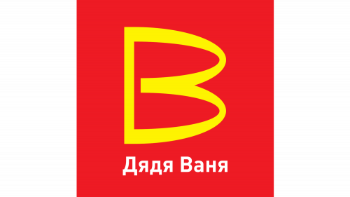
The Dyadya Vanya brand designers, Logomashine Studio, didn’t bother with this logotype too much. The just took the original McDonald’s ‘m’ letter, put it on a side, and added a bar connecting the letter’s two ends, thereby forming the capitalized ‘b’ character. Below the symbol, they wrote the name in Russian. All this was drawn on a square background.
Color
The coloring wasn’t changed as well, except for the character’s shade. The orange (not yellow) letter is placed on a red square. Below the symbol, there is the white nameplate.
Font
The Logomashine designers wrote the name in a sans-serif typeface with small gaps between the characters. This font is named FF DIN Pro Bold.


