Dunhill Logo PNG
The Dunhill logo does not include any indication of the fact it belongs to a cigarette brand. Yet, the elements of the packaging design give a hint of the company’s impressive heritage.
Meaning and history

In 1893, Alfred Dunhill, who was 21 back then, took over his father’s saddlery business and turned it into Dunhill’s Motorities. In 1904, he had patented a “Windshield Pipe,” which was supposedly capable of helping a driver resolve the problems caused by the wind and weather while smoking in his open-top car. Three years later, he opened a pipe, cigar, and tobacco shop on Duke Street in London.
Today, the cigarette brand is owned by British American Tobacco.
At the beginning of its history, Dunhill used various logos for its tobacco products. Sometimes, the name of the marque was given in a handwritten script, while in other cases, the company experimented with the letters separated by gaps (they often included elaborate curls or other distinctive elements).
What is Dunhill?
Dunhill is the name of a luxury accessories and clothing brand for men, which was established by Alfred Dunhill in 1893. Today the chic products of the British brand are sold all over the globe and are synonymous with luxe, style, and quality.
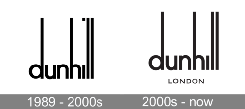
1989 – 2000s
The first logo of the Dunhill brand was created in 1989 and stayed with the company for more than a decade. It was a lowercase lettering in black, executed in a modern full-shape sans-serif font with the vertical bars of the “D”, “H” and both “L”s elongated up. The square above the “I” was moved to the upper border of the badge.
2000s – Today
After the minor redesign of the Dunhill visual identity, the square above the “I” was removed, and the iconic wordmark got accompanied by the “London” tagline in the uppercase of a medium-weight geometric sans-serif typeface, with the characters slightly extended horizontally.
Current logo
The design forces behind the brand have opted for a simple bold sans. It looks pretty much like Helvetica Bold except for a couple of details. For instance, the middle bar in the “H” is slightly lower, which helps to create a single horizontal direction for the viewer’s glance (from the end of the diagonal line on the “N” to the horizontal lines of the double “L”).
While the older version looked slightly different, the horizontal bar on the “H” was also lower than average.
To the left of the wordmark, a stylized “D” is placed. It is often given in a different color than the lettering.
In addition to the Dunhill logo, the package also features an elaborate design composition looking very much like a medieval coat of arms. This element reminds us that the company is proud of its heritage – the firm supplied George VI with tobacco through the 1930s and got its first Royal Warrant, as Tobacconist to Edward, Prince of Wales, in 1921.
Font and color
The sleek lowercase lettering from the primary Dunhill badge is set in a modern and clean sans-serif typeface with elongated vertical bars of the letters, making the inscription look unique. The closest font to the one, used for this insignia is, probably, Vilane Medium, but with slight modifications of some contours.
As for the color palette of the Dunhill visual identity, the luxury brand chooses black as the main shade for its stylish lettering. The black-and-white combination elevates the expensive look of the Dunhill badge and makes it look timeless and sophisticated.


